X-Cite Packaging Case Study
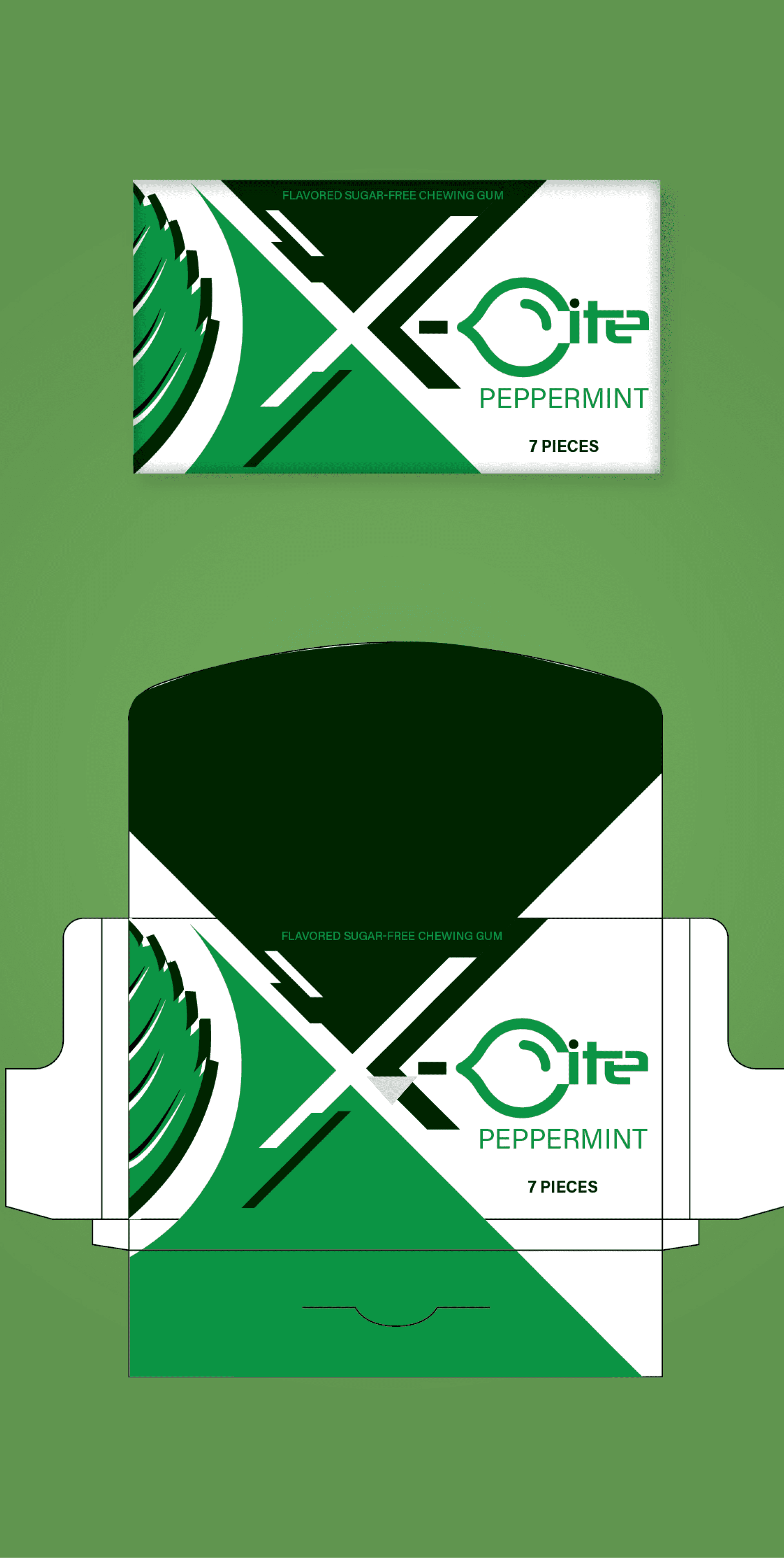
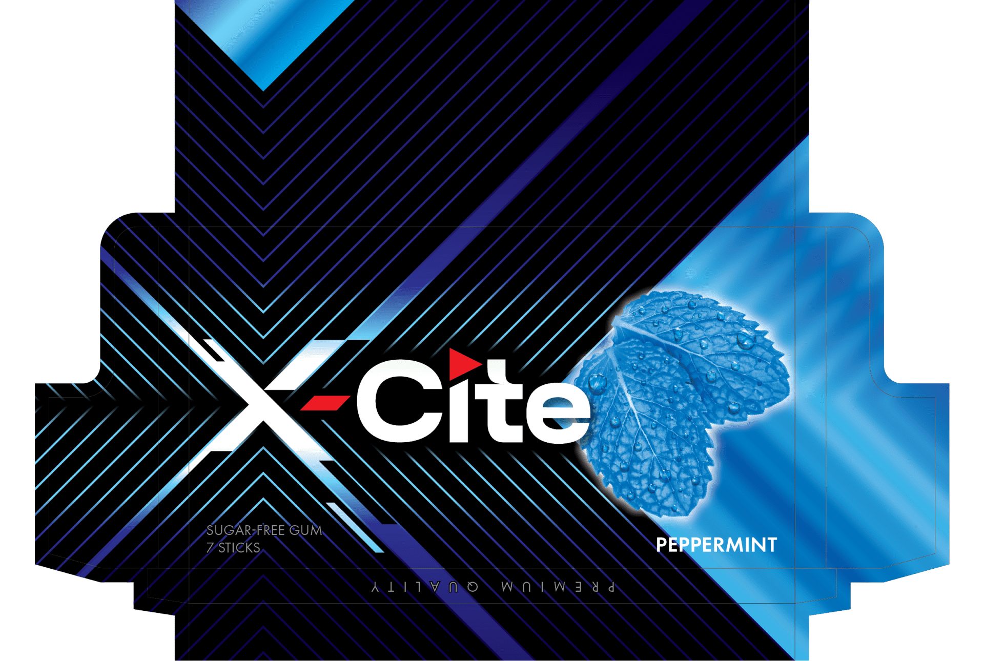
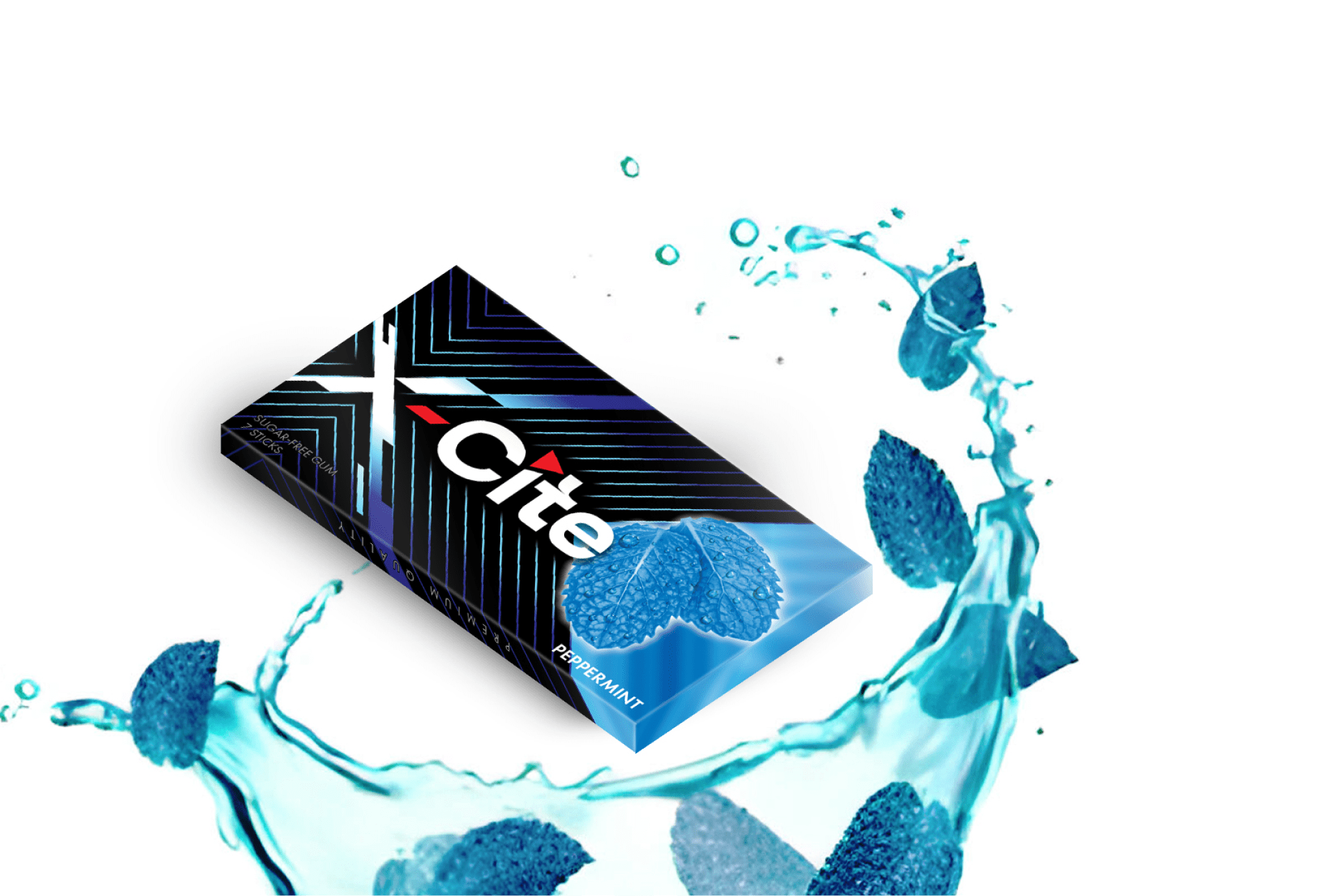
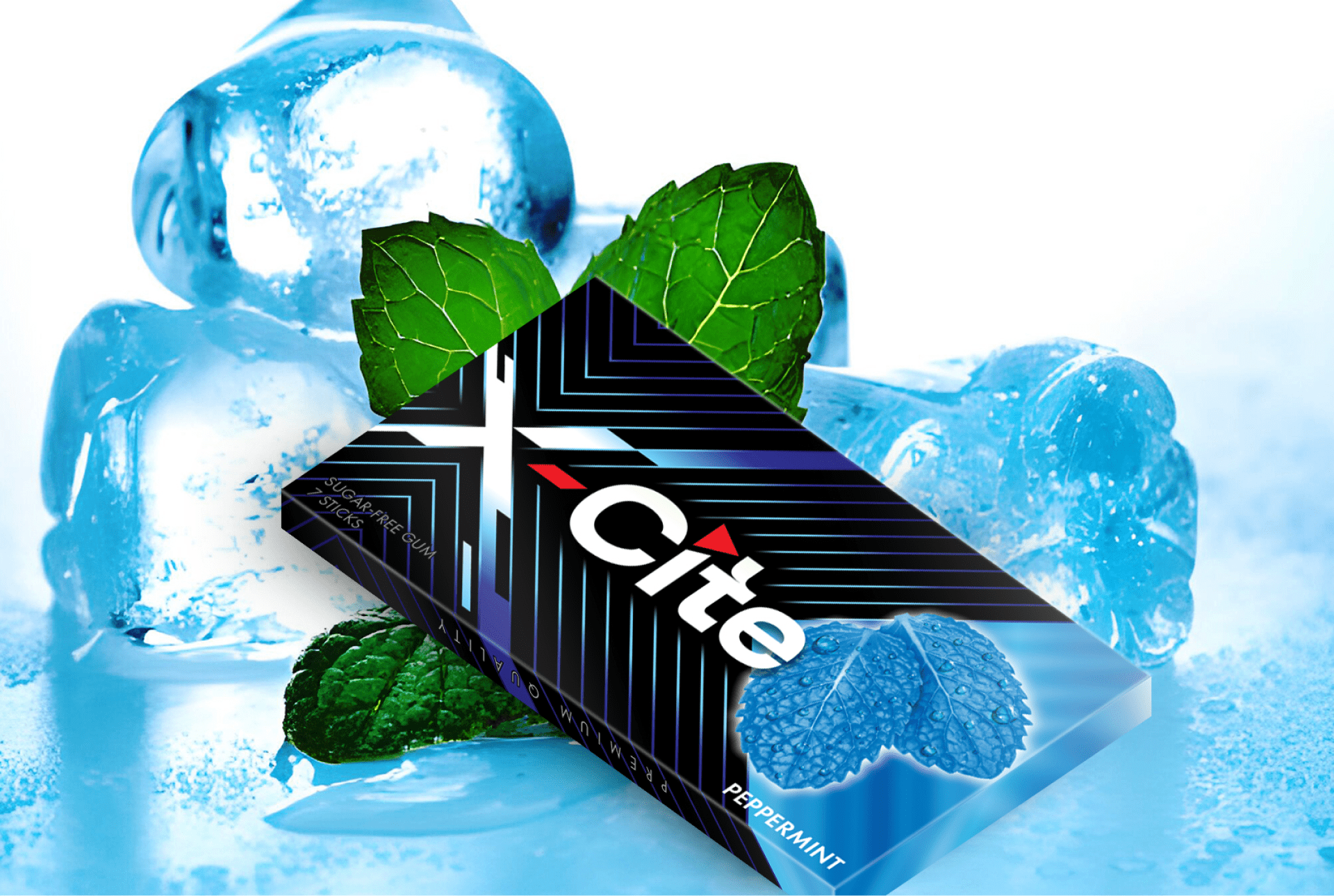
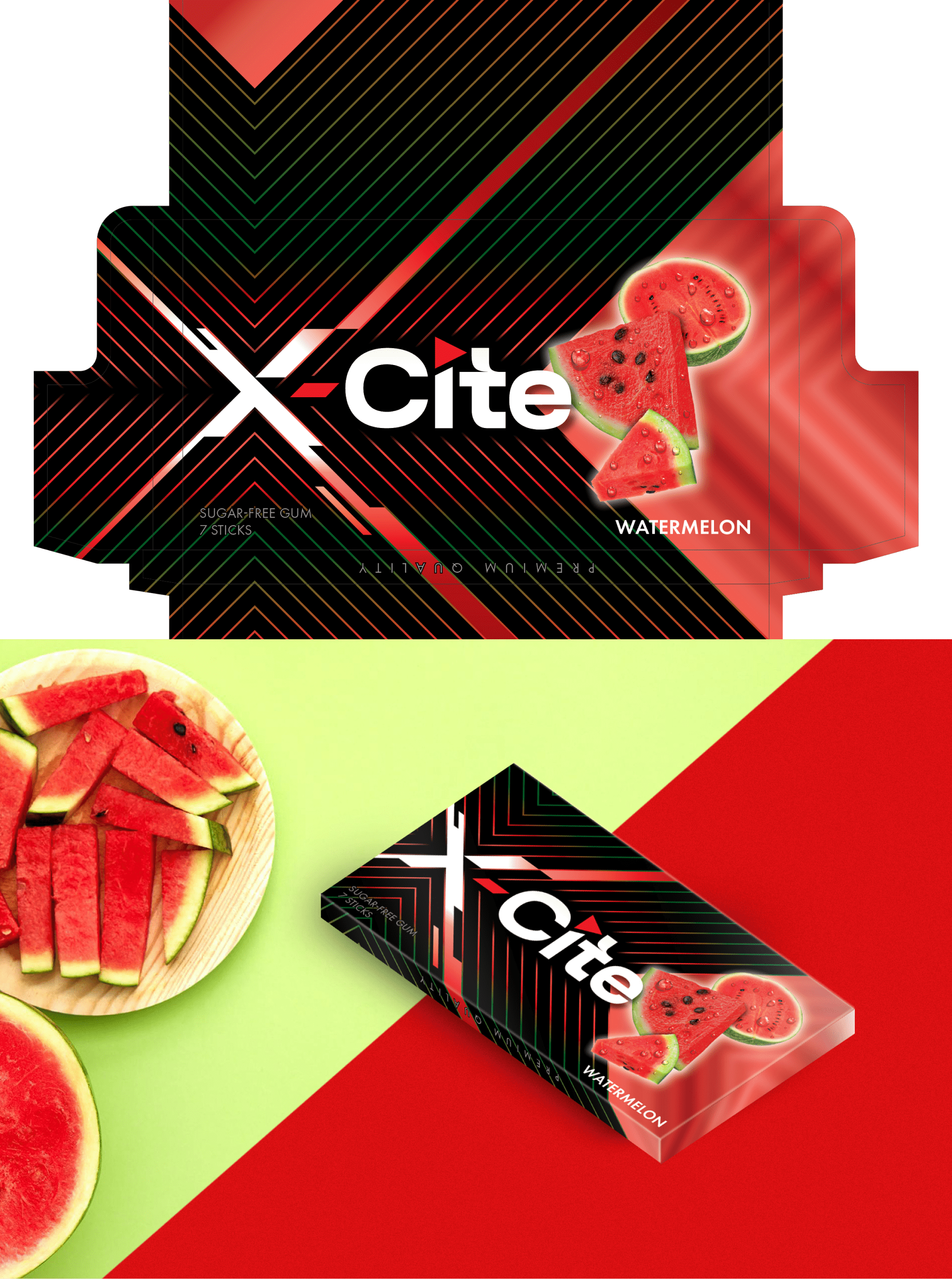
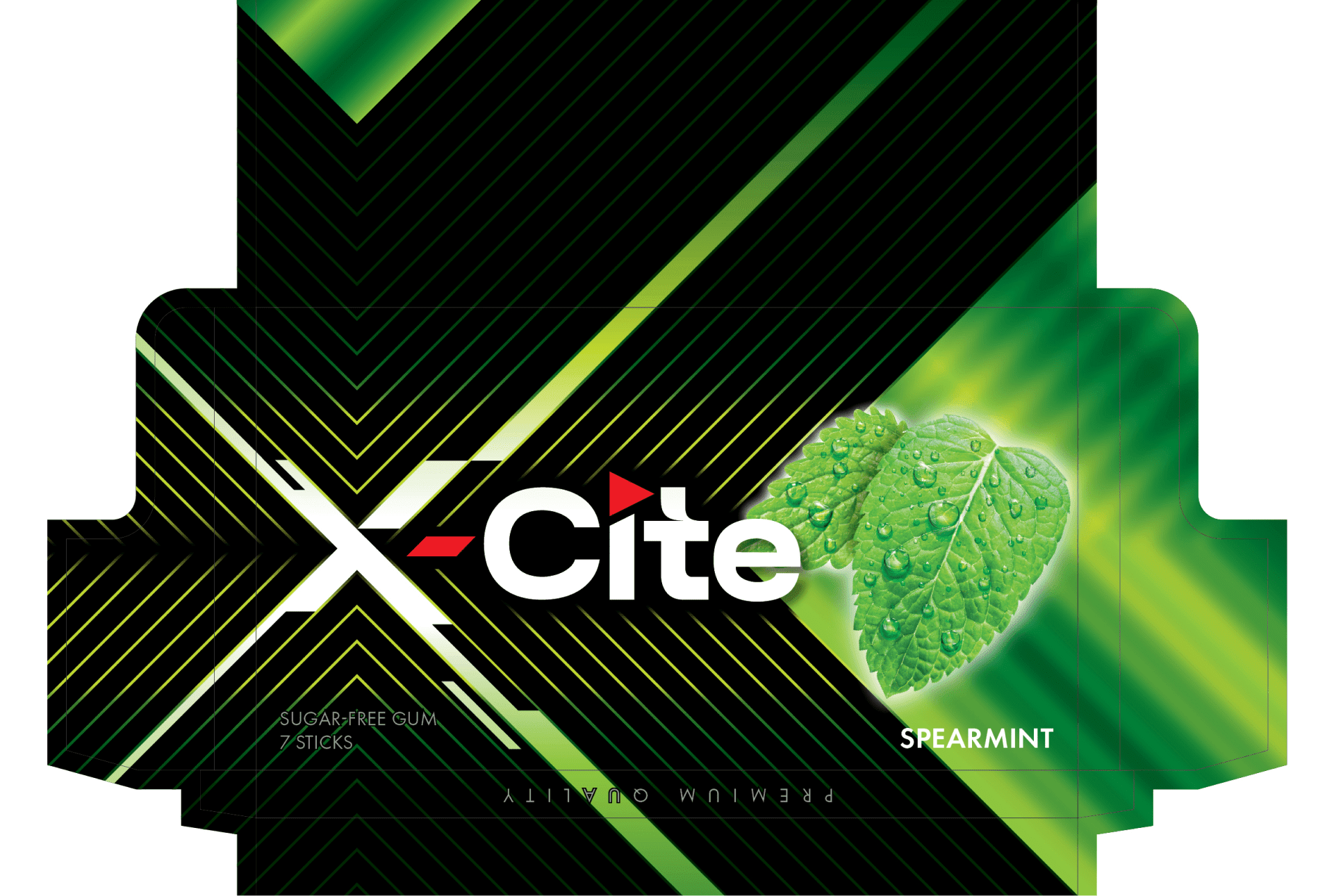
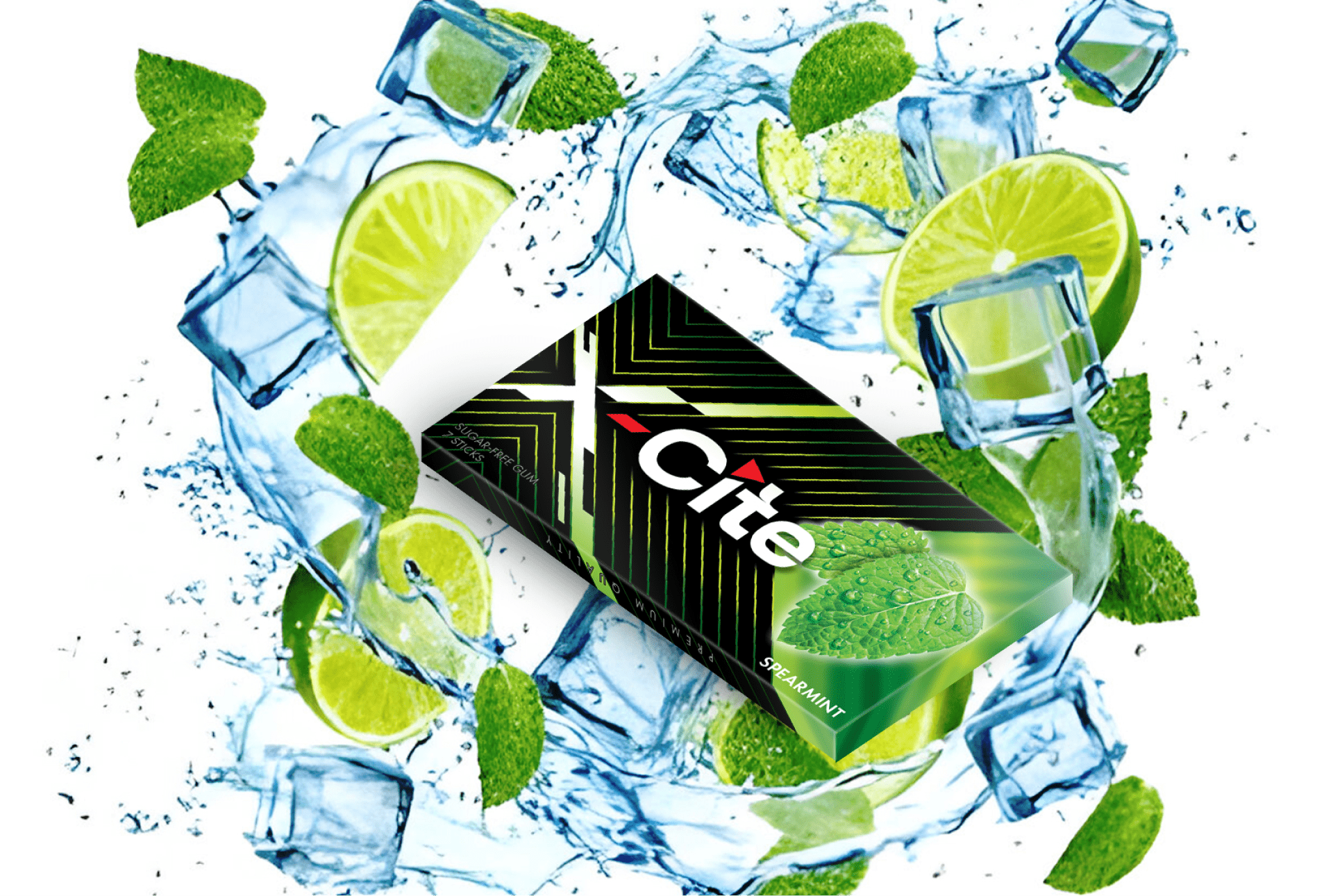
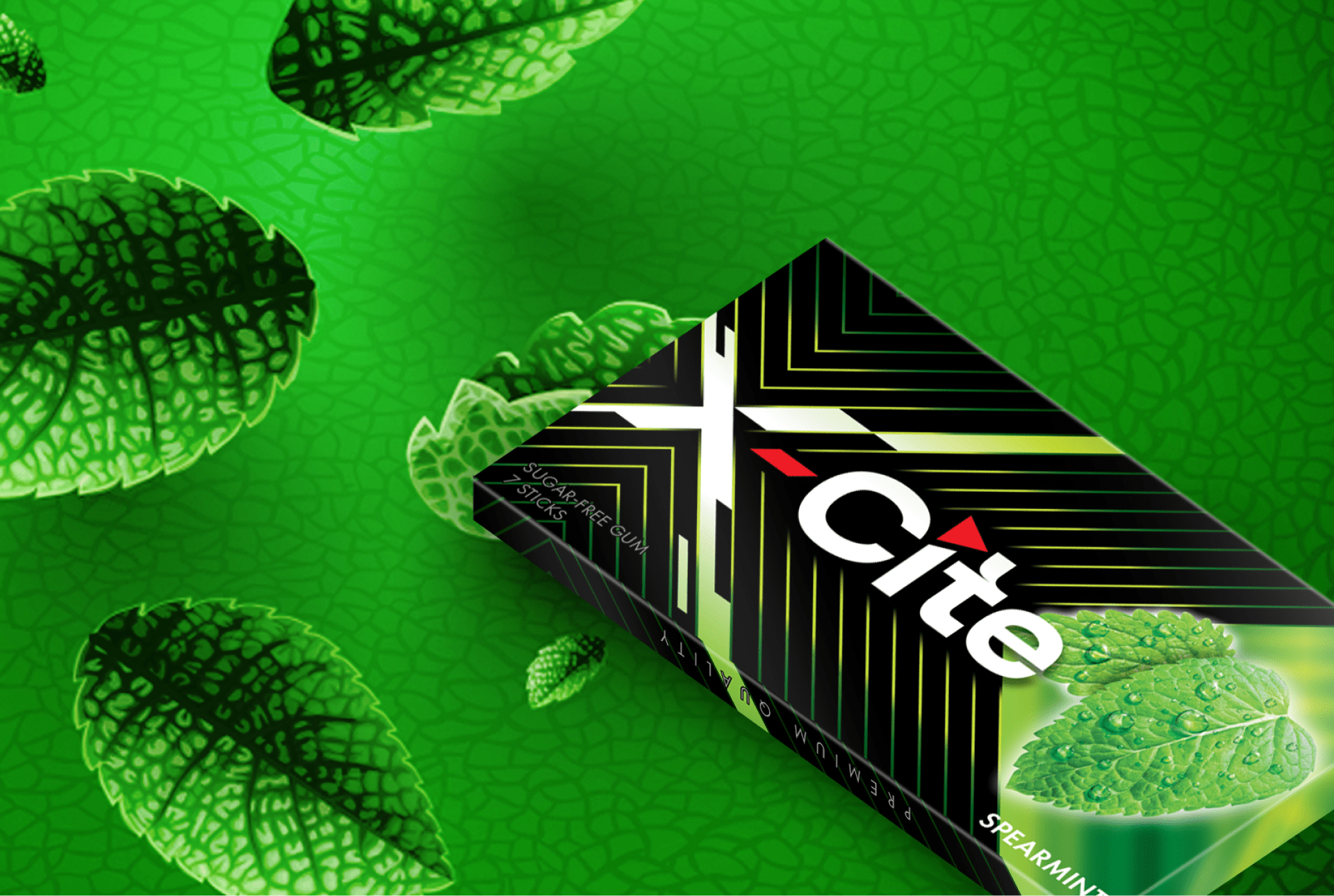
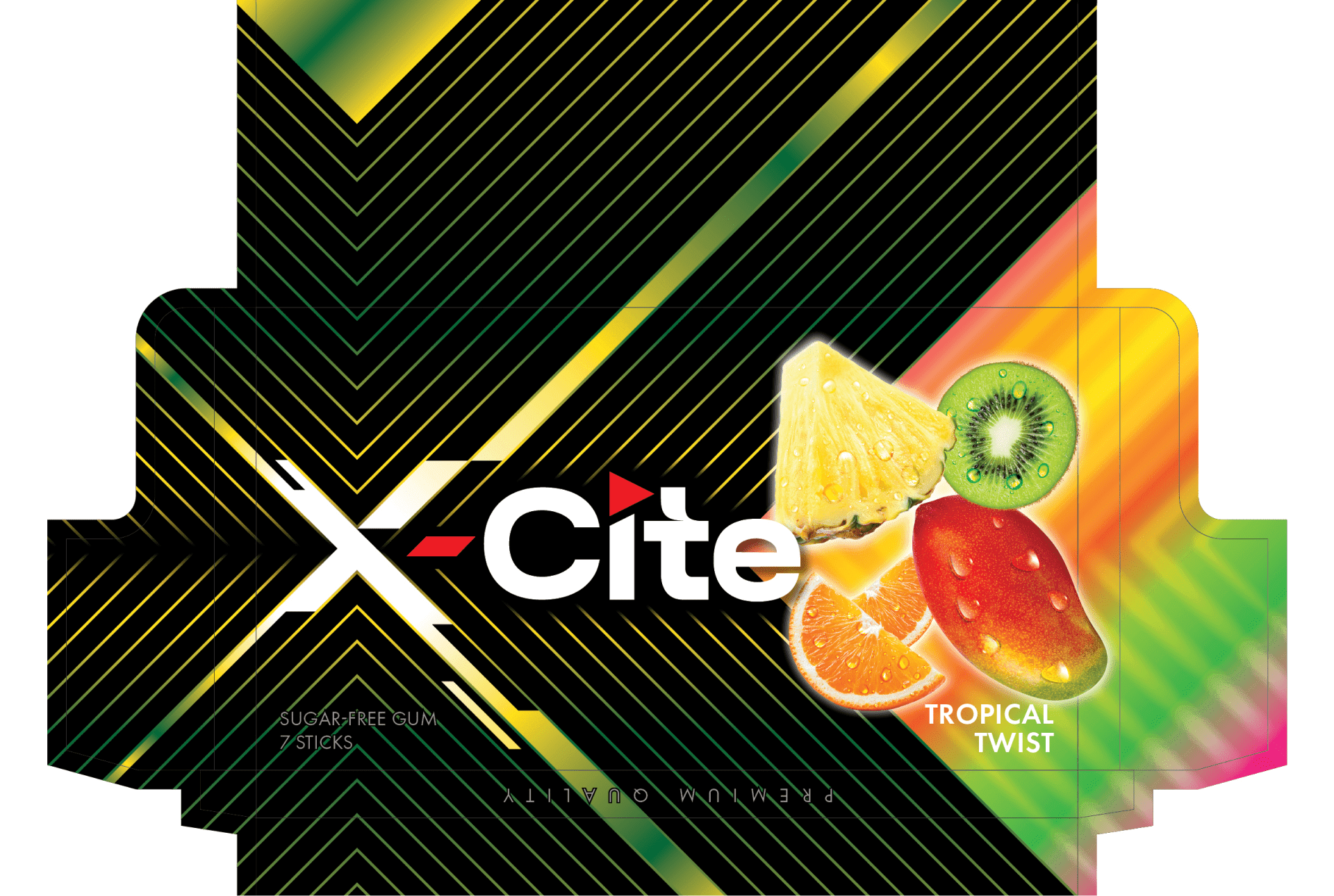
X-Cite Brand approached Maxobiz for a fresh take on their logo and packaging design, as their existing design was too basic and failed to capture customer attention. We conducted in-depth research into their brand and target audience, aiming to create a design that truly resonated. By reimagining their visual identity, we crafted a bold, eye-catching logo and packaging that effectively communicated the brand’s unique essence, helping X-Cite stand out in a crowded market and connect more deeply with consumers.
Services
Logo Design
Packaging
Results
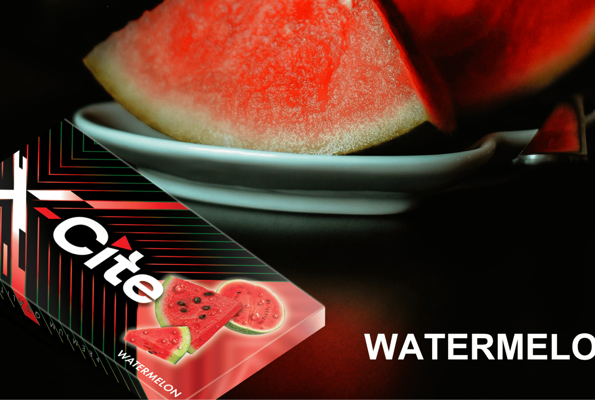
The result of our collaboration with X-Cite Brand was a striking transformation. The new logo and packaging design captured the essence of their brand, making it more dynamic and appealing. The bold, modern visuals attracted attention on shelves and resonated with their target audience. X-Cite saw an immediate increase in customer engagement and brand recognition, as the refreshed design not only stood out visually but also conveyed the brand’s values and personality more effectively. This redesign played a key role in strengthening X-Cite’s market presence and boosting sales.
Brand Awareness Metric
85%
Satisfied Loyal Customers
200+
What Our Clients Say About Us
-


- 4.9 rating out of 150+ Google reviews.


