Why Colours Can Speak Louder Than Words
Introduction:
Imagine walking through a busy marketplace, surrounded by lots of logos trying to get your attention. But one logo stands out from the rest, not because of fancy shapes or fancy letters, but because of the way it uses colours. A certain colour catches your eye and makes you feel a certain way. It affects how you see things and how you choose. In another part of the marketplace, you see another logo that makes you feel calm and like you can trust it. This is the interesting world of colour psychology in logo design.
Impact of Colour on Branding:
Colours can make us feel different emotions and think certain things without us even realizing it. Logo designers know this and pick colours that match what their brand is about and who they want to reach. By using the right colours, they make a strong connection with their customers.Understanding colour psychology in logo design is important for businesses. It helps them to make a good impression on their customers and make them feel something special. Colours are like a secret way of talking to us, where we don’t even need words. So, next time you see a logo that catches your eye, think about how the colours make you feel and what they might mean. It will help you understand the power of colour in logo design.
Section 1: Basics of Colour Psychology

Colour Psychology Overview
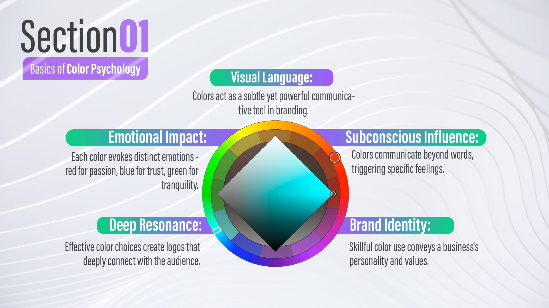
Colour holds incredible power beyond its superficial appearance. It can speak to our emotions in ways that words alone cannot. Think about the comforting warmth of a sunset, filling us with hope and inspiration. Consider the refreshing green of a forest, inviting us to find tranquillity and renewal. Colours communicate with our subconscious, triggering a range of feelings and associations that shape our experiences.
Colour and Subconscious Impact:
In the realm of logo design, understanding the impact of colour is crucial. Different colours can evoke distinct emotions and leave a lasting impression on our minds. They can enhance brand messaging, establish connections with customers, and convey the desired personality or values of a business.Whether it’s a vibrant red that signifies passion and excitement, a soothing blue that instils trust and reliability, or any other colour on the spectrum, each hue has a profound effect on how we perceive and engage with a brand. By harnessing the power of colour psychology, businesses can create logos that resonate with their target audience on a deeper level.
Colours become a visual language through which they can communicate their brand identity, evoke specific emotions, and shape the perception of their products or services. Next time you encounter a captivating logo, take notice of the colours used and the feelings they elicit within you. You’ll start to realize the remarkable influence colour has in the realm of logo design, acting as a silent communicator that speaks directly to our emotions.
Section 2: Colour Emotions
So, let’s embark on a vibrant journey through the emotional spectrum of colours and explore how they wield their magic in the realm of logo design:
Red: Passion and Alertness:
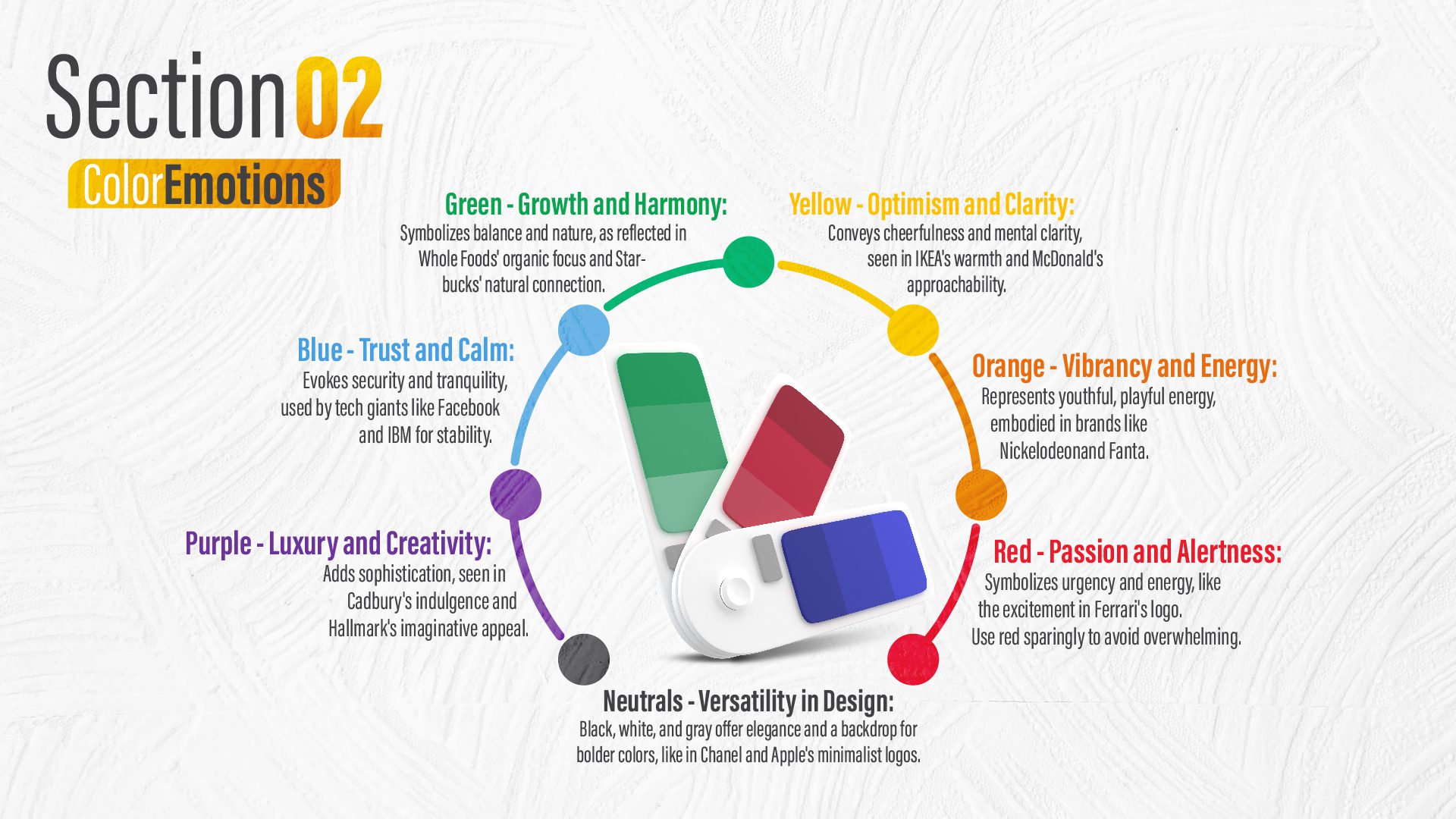
The fiery king of the palette, red represents passion, urgency, and vibrant energy. Picture the exciting rush you experience when looking at a Ferrari logo or the confident presence of a Coca-Cola bottle. However, it’s important to use red wisely and sparingly, as its captivating allure can easily become overwhelming.
Orange: Vibrancy and Energy:
Orange, like a burst of sunshine, embodies a vibrant and optimistic energy. It exudes a youthful and playful charm, with a touch of mischievousness. Just think of Nickelodeon, whose playful orange hue perfectly represents its fun-loving spirit. Similarly, Fanta’s citrusy orange colour promises a delightful burst of refreshing enjoyment
Yellow: Optimism and Clarity:
The colour of sunshine and sunflowers, yellow brings a wave of optimism, cheerfulness, and mental clarity. Think IKEA’s warm embrace or McDonald’s golden arches, evoking happiness and approach ability.
Green: Growth and Harmony:
Green, like a refreshing breath of air, represents growth, balance, and harmony with nature. When we see the lush green colours of the Whole Foods logo, it reminds us of the goodness of organic products.The leafy logo of Starbucks hints at its connection to nature and the importance of well-being. Green is a colour that brings a sense of calm and a reminder of our connection to the natural world around us.
Blue: Trust and Calm:
Blue, like the ocean and sky, represents trust, security, and tranquillity. It is a colour that can evoke a feeling of calmness. Tech giants like Facebook and IBM recognize the power of blue and use it in their logos to inspire confidence and convey a sense of reliability. When we see the colour blue, it reminds us of stability and peace.
Purple: Luxury and Creativity:
A mysterious and luxurious colour, adds a touch of sophistication and creativity. Cadbury’s elegant use of purple in its branding conveys a sense of indulgence and luxury. Similarly, the regal shade of purple in Hallmark’s logo evokes imagination and wonder. Purple has a unique ability to captivate our attention and create an atmosphere of elegance and creative expression.
Neutrals: Versatility in Design:
lack, white, and gray, the silent partners of the palette, offer timeless elegance and versatility in design. They provide the perfect canvas for bolder colours to shine, as seen in the minimalist logos of Chanel and Apple, where form speaks volumes.

Section 3: Contextual Colour Meanings
The story doesn’t end there! Colour, like a chameleon, can adapt and change its meaning depending on culture, industry, and age.
Cultural Colour Interpretations:
Colours aren’t just pretty decorations, they whisper secret messages! Different cultures understand these whispers differently. For example, while red represents luck and good fortune in Chinese culture, it is associated with danger in Western societies.
Demographic Colour Perceptions:
Even age and background matter! Teenagers love bold, energetic colours, while grandparents might prefer softer, familiar ones. Understanding these preferences helps us speak their language.
Section 4: Colour Strategies
So, how can we effectively use this powerful tool to create a logo that deeply connects with people?
Choosing Colours for Branding:
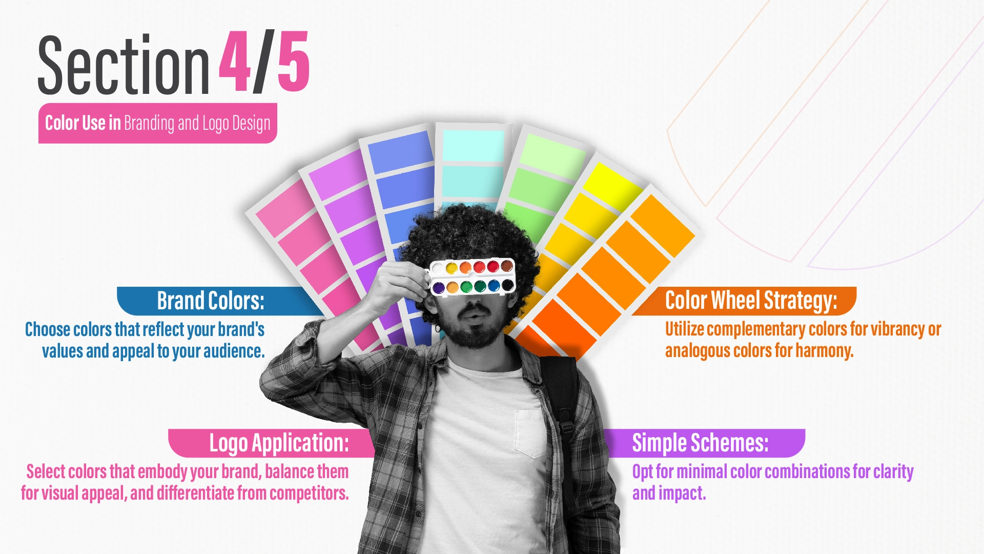
Choosing colours for branding is a big decision. It means picking colours that represent your brand in a good way. You should think about what your brand stands for, who your audience is, and how colours can make people feel. Colours have a strong impact on how people see and feel about your brand, so it’s important to choose them carefully.
Navigate the colour wheel:
It’s your map of harmonious colour combinations Colours that are opposite each other on the colour wheel, called complementary colours, create lively and eye-catching combinations. On the other hand, analogous colours that are next to each other on the colour wheel create a calm and harmonious feeling. Imagine a tech startup embracing a dynamic orange-blue duo, representing innovation and stability. Or a spa brand basking in the serenity of soft greens and calming blues.
Effective Colour Combinations:
Don’t overwhelm viewers with a rainbow. A well-chosen duo or trio can be your logo’s secret weapon. Think of Nike’s iconic black-and-white swoosh, or Lacoste’s green crocodile on a crisp white background. Each colour choice is deliberate, leaving a lasting impression without visual clutter.

Section 5: Applying Colour in Logos
Finally, applying these principles to your logo creation involves:
Selecting Logo Colour Palettes:
Selecting a palette that captures your brand essence. Are you a bold, passionate red, or a serene, trustworthy blue?
Balancing Colours in Design:
Balancing colours for visual harmony and impact. Think of contrasting drama elements or analogous colours for a calming effect.
Brand Differentiation with Colour:
You are using colour to differentiate yourself from competitors. Stand out from the crowd with a unique colour combination that reflects your brand’s individuality.
Conclusion:
In a busy world of logos, colour is really important. It’s not just about picking a colour. It’s about making your logo tell a story and connect with people’s feelings. Here are some simple tips for using colour in your logo
Know who you’re making the logo for:
Different age groups like different colours. For example, young people might like bright oranges and blues, while older folks might prefer black, white, and gold. Pick colours that your audience likes.
Think about colours for men and women:
Some colours are linked to being masculine or feminine. Pink is often seen as girly, and blue as boyish. But don’t just stick to these stereotypes. Choose colours that fit what your brand is about, no matter who it’s for.
Be aware of colours in different cultures:
Colours mean different things around the world. A colour that’s lucky in one place might be sad in another. This cultural difference in logo design is crucial. Research to ensure your colours align with the cultural context of your audience.
Use colour tricks:
Colours can make things look bigger or smaller. Warm colours like red make things look bigger, and cool colours like blue make them look smaller. Use these tricks to make your logo just right.
Think about people who see colours differently:
Some people can’t see all colours. Make sure your logo still works for them. Use strong contrasts and clear shapes.
Tell your brand’s story with colour:
Your logo should share your brand’s story. Use colours to show what your brand is about. For example, Starbucks uses green to show nature and growth.
Be different with your colours:
Don’t be afraid to use unusual colour combinations. This can make your logo stand out. Look at Airbnb’s red and pink or Spotify’s bright green. These colours make them unique.Remember, using colours in your logo is about more than just looking good. It’s about making your brand memorable and connecting with people. Don’t just follow rules. Try different things and see what fits your brand’s story best.


