Impactful Pamphlet Design
As far as attracting attention and delivering the intended message, pamphlet design is one of the most effective means. Whether it is an event announcement, product release, or important information dissemination, the layout of the pamphlet determines its effectiveness. While an impactful pamphlet is not about good looks, it is about the right content; the information provided should be clear, interesting, and memorable.

Compelling Pamphlet Creation
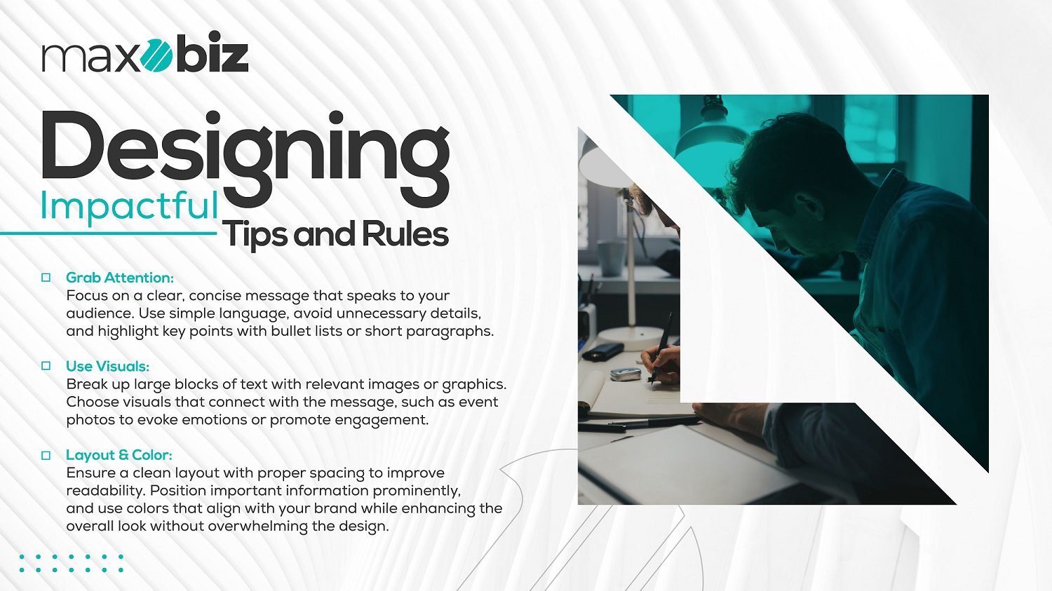
Pamphlets and fliers basics of creating an appealing one begin with the choice of your target audience. What will they need to know? Where would you like them to go? With these answers in place, it is possible to begin developing content that inspires readers while educating them at the same time. Do not use any complicated terms or professional terms which your readers may not understand. Also, many words must not be added to your pamphlet so that they become hard to read. However, it is better to emphasize key messages and present the data in the form of bullet lists and brief paragraphs.
Also Read This Blog: Infographics Design Trends: Staying Ahead in Visual Communication
The other crucial aspect of pamphlet creation is picture use, which is also essential in making the pamphlet interesting. At some point, it may become tiring to read blocks of text and that is why in a pamphlet we have the provision of using images icons, and graphics. Use images, videos, and animations that complement the material to be created and will be appreciated by the audience. For instance, when selling tickets to a charity event, it could be effective to post images from previous events to elicit an emotional response from the audience.
Pamphlet Layout Mastery
It is therefore crucial to arrange your pamphlet in a professionally correct manner to enhance the flow of information. A good layout makes it easy for the audience to follow and at the same time, make sure that critical information is conspicuous. Begin by having a headline that makes one sit up and pay attention right from the onset. You should employ subheadings to divide the text and help the reader navigate through your material.
The layout should also ensure that there is a good integration of both text and graphics design. It is a common mistake to overcrowd the paper; therefore, make sure there is sufficient space between the sentences. This makes it easier for readers to capture your message effortlessly without straining. Secondly, look into the flow of information and or traffic. Try to position the most significant information at easy-to-spot locations, e.g. in conspicuous parts of the pamphlet, including headers.
Another significant feature of the layout is a color option. Choose color schemes that you associate with your brand or the message you are promoting. For instance, warm colors like red and orange can create a pre-sell atmosphere and make people feel they need something, on the other hand, cool colors like blue and green invoke trust and well-being. Just make sure that the selected colors do not hinder the readability aspect and rather add value to it.
Also Read This Blog: Choosing the Right Social Media Graphic Design Agency: Factors to Consider
Conclusion
Every pamphlet that is to make a difference has to go through certain elements of creation, whereby the message being passed across is developed and packaged. In other words, by demonstrating attention to your audience’s needs and preferences, coming up with appealing content, and adhering to proper formatting, you have a great shot at crafting a pamphlet that will both attract consumers’ attention and encourage them to act. As simple as it may sound, sometimes your pamphlet is the first thing people will see of your message – so, use it to impress!
Next time, you are involved in developing a pamphlet, consider the use of these strategies as you see a notable improvement in the effectiveness of your communication and increased relevance to the targeted audience. What will the next pamphlet contain?


