


In this captivating exploration, we embark on a journey through the fascinating world of logo evolution, delving into the transformations of some of the most iconic brands across diverse industries. Hold on tight, as we unveil the stories behind these symbols and discover how they have shaped the way we perceive brands today.
Tech Giants and Their Brand Evolution
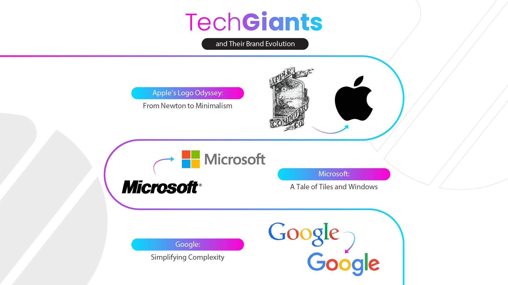
Apple’s Logo Odyssey: From Newton to Minimalism
Apple’s logo journey began with a rather complex image of Sir Isaac Newton sitting under an apple tree. This symbolized the brand’s connection to scientific discovery and innovation. Over the years, the logo shed its intricate details, becoming increasingly simpler and more minimalist. Today, the iconic bitten apple design stands as a testament to Apple’s dedication to sleek design and user-centricity.
Microsoft: A Tale of Tiles and Windows:
Throughout its history, Microsoft’s logo has undergone fascinating transformations that reflect the brand’s fascination with geometric shapes and its association with technology and innovation. From its early iterations reminiscent of a pixelated Pac-Man character to the modern Windows logo featuring four colourful squares, each design has sought to convey Microsoft’s commitment to pushing boundaries and developing cutting-edge software solutions.
The evolution of Microsoft’s logo demonstrates the brand’s agility and adaptability in an ever-changing technological landscape. With each new logo design, Microsoft strives to capture the essence of its innovative spirit and communicate its forward-thinking approach to the world. The transition from the early pixelated logo to the sleek and minimalist Windows logo is symbolic of Microsoft’s evolution and growth as a company.
It represents their ability to adapt to changing times while staying true to their core values of technological advancement and creative problem-solving. As Microsoft continues to evolve and expand its offerings, likely, future logo designs will likely further showcase the company’s commitment to innovation and its role as a leader in the rapidly advancing world of technology.
Google: Simplifying Complexity:
Google’s logo has gone through significant changes over time, showcasing the company’s dedication to simplicity and efficiency. The logo originally had a font with small decorative lines, but it later shifted to a cleaner and more modern look with a sans-serif font. The colourful rainbow palette was also simplified to the iconic blue, red, yellow, and green colours we see today.
These updates reflect Google’s commitment to simplicity, as well as their belief in creating products and services that are user-friendly and easy to understand. The refined logo design has become instantly recognizable around the world, representing the innovative and user-focused approach that Google is known for. As Google continues to evolve and expand its services, the logo may likely undergo further subtle changes to adapt to new trends and better embody the company’s core values.
Fashion and Lifestyle Brands: Emblazoned with Legacy
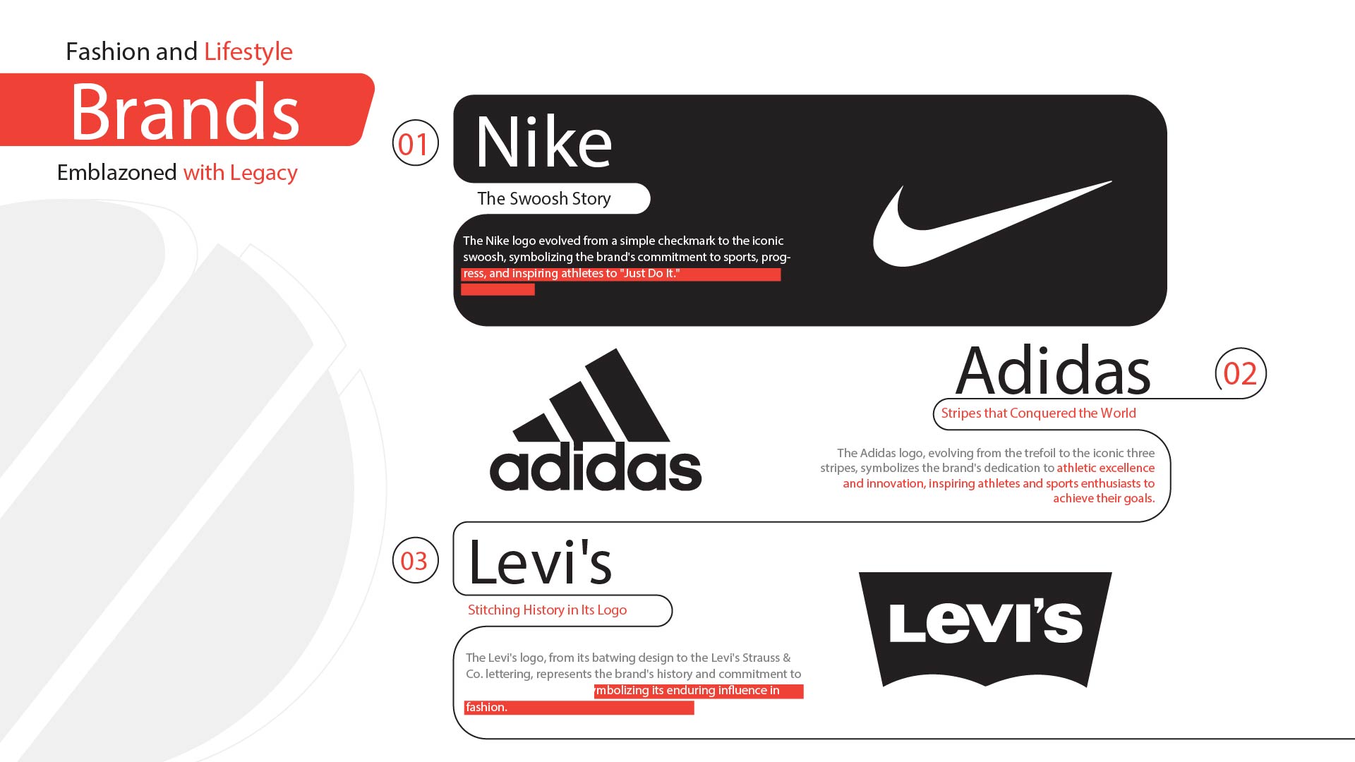
Nike: The Swoosh Story:
Nike’s logo has transformed over time, starting as a basic check mark and evolving into the famous swoosh we know today. This dynamic symbol represents Nike’s connection to sports, activity, and reaching personal goals. The logo’s changes demonstrate Nike’s commitment to continual progress and inspiring athletes of all abilities to take action and pursue their dreams, encapsulated by the memorable slogan “Just Do It.”
Adidas: Stripes that Conquered the World:
Adidas’ logo has been a steadfast presence in the brand’s rise to prominence as a major player in the sportswear industry. Over the years, the logo has evolved from the well-known trefoil design to the iconic three-stripe motif that graces their clothing and shoes. Each version of the logo has sought to convey Adidas’ commitment to overcoming obstacles and pushing the limits of athletic achievement.
The logo serves as a symbol of the brand’s dedication to excellence, providing athletes and sports enthusiasts alike with high-quality products that inspire confidence and help them reach their goals. Adidas’ logo stands as a testament to their enduring legacy and their ongoing pursuit of innovation in the world of sports.
Levi’s: Stitching History in Its Logo:
Levi’s logo has a timeless quality that perfectly matches their iconic denim jeans. From the traditional batwing design to the current Levi’s Strauss & Co. lettering, the logo encapsulates the brand’s extensive history and commitment to top-notch craftsmanship. It serves as a steadfast symbol of Levi’s long-standing influence in the fashion industry, representing their enduring legacy.
From Food to Automobiles: Diverse Industries, Diverse Logos
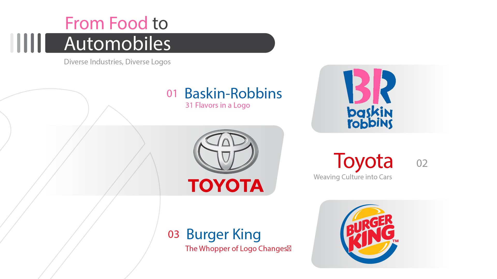
Baskin-Robbins: 31 Flavors in a Logo:
Baskin-Robbins’ logo is a playful and mouthwatering representation of its vast selection of ice cream flavors. The iconic pink number “31” sits prominently, inviting consumers to explore the endless possibilities of delicious combinations. This simple design perfectly captures the brand’s essence of fun, variety, and endless indulgence.
Toyota: Weaving Culture into Cars:
Toyota’s logo, with its overlapping ellipses, is a symbol of unity and collaboration. The ellipses represent the hearts of the customer and the company, coming together to create a shared passion for quality and innovation. This reflects Toyota’s commitment to building strong relationships with its customers and delivering reliable vehicles that exceed expectations.
Burger King: The Whopper of Logo Changes:
Burger King’s logo has seen more changes than a fast-food menu. Each transformation aimed to enhance brand recognition and appeal to contemporary audiences, from a cartoonish character to a modern and streamlined design. The most recent iteration features a more playful font and a vibrant color scheme, reflecting the brand’s fun-loving personality.
Starbucks: From Mermaid to Minimalism:
Starbucks’ logo has undergone a fascinating transformation, shedding its initial detail in favour of a more minimalist approach. The iconic mermaid design, once adorned with a crown and flowing hair, has become a sleek and simplified silhouette. This reflects the brand’s evolution towards a focus on coffee quality and a more modern aesthetic, while still retaining its playful and inviting spirit.
The mermaid’s tail, now flowing in a single, graceful arc, adds a touch of elegance to the design. The overall impression is one of sophistication and refinement, yet it still conveys the warmth and inclusivity that Starbucks is known for. This balance between old and new, tradition and innovation, perfectly embodies Starbucks’ journey from a small coffee shop to a global brand.
Communication and Finance: Logos that Speak Volumes
AT&T: Rings of Evolution:
AT&T’s iconic logo tells a story of global connectivity and innovation. It features a blue and white globe with overlapping rings, symbolizing the brand’s commitment to connecting people and bridging distances. The logo’s evolution showcases AT&T’s continuous efforts to remain at the forefront of communication technology.
Visa: Blue and Gold Progression:
Visa’s logo is synonymous with trust and security in the financial world. The simple yet elegant design features the brand name in blue and gold, colours that evoke feelings of reliability and professionalism. Over time, the logo has undergone subtle refinements, but it has always maintained its classic and trusted appearance.
FedEx: Hiding Genius in Simplicity:
FedEx’s logo is a masterclass in using negative space to create a powerful message. The “E” and “x” are cleverly designed to form an arrow, subtly conveying the brand’s focus on speed and efficiency. This minimalist design demonstrates the power of simplicity in effective logo design.
The Photographic Journey of Logos
Kodak: Capturing Moments in Branding:
Kodak’s logo has always incorporated the letter “K” and the iconic yellow color, forever linking the brand to photography and capturing precious memories. Over time, the logo has become more streamlined and modern, reflecting Kodak’s adaptation to evolving technology and the ever-changing world of photography.
Pepsi: A Swirl of Changes:
Pepsi’s logo has undergone a whirlwind of transformations, mirroring the brand’s dynamic and youthful personality. From a script font to a globe design and finally, to the current circle-and-wave motif, each change aimed to maintain brand recognition while appealing to contemporary audiences. The logo’s evolution reflects Pepsi’s constant desire to stay relevant and exciting in a competitive market.
Retail Giants: Reflecting Growth and Change
Walmart: From Hyphen to Spark:
Walmart’s logo has shed its hyphen and embraced a bold and modern font. The new design, with its spark-like “a,” symbolizes the brand’s commitment to offering affordable products and exciting shopping experiences. It reflects the company’s growth and its continued focus on providing value to its customers.
Amazon: From A to Z and Beyond:
Amazon’s logo has transitioned from a simple text-based design to the iconic “smile” with an arrow pointing from A to Z. This cleverly represents the brand’s vast selection of products and its commitment to offering customers everything they need, from A to Z and beyond. The logo’s evolution reflects Amazon’s rapid growth and its ambition to become the world’s most customer-centric company.
Conclusion: A Reflection of Time
By examining the evolution of logos, we gain a deeper understanding of brands and their journeys. We see their values reflected in their visual brand identity, and we witness their adaptations to changing times and consumer preferences. Each logo tells a story, and by listening to these stories, we gain a richer appreciation for the power of branding and its impact on our lives.
This blog is just a glimpse into the captivating world of logo evolution. As brands continue to grow and evolve, we can expect to see even more fascinating transformations in the years to come. By keeping an eye on these changes, we can better understand the ever-shifting landscape of branding and the stories that brands choose to tell through their logos.
Additional Section: Interactive Comparisons
To enhance the visual impact of this blog, consider incorporating an interactive section featuring sliders that showcase the logo changes of different brands over time. This allows readers to dynamically explore the evolution of each logo, gaining a deeper understanding of its design journey. By combining informative content with engaging visuals, this blog delves into the fascinating world of logo evolution, offering a valuable resource for anyone interested in branding and design.