


Discovering Your Brand’s Essence
Before we even think about designing, we need to chat about your brand’s essence. What’s that? Well, it’s like the heart and soul of your brand. Imagine your brand as a person. How would you describe its personality? Is it bold and innovative, or classic and trustworthy? The vibe you’re going for will guide every choice you make for your business card. It’s like choosing an outfit for an interview – you want to make sure it says all the right things about you!
Word got you down? Unleash its hidden superpower – you can design stunning business cards! Unlocks the secrets: Format finesse, font fortitude, & visual vigor. Master color psychology, pick the perfect paper, and design like a pro! Ditch the fancy software, Word’s your budget-friendly hero.
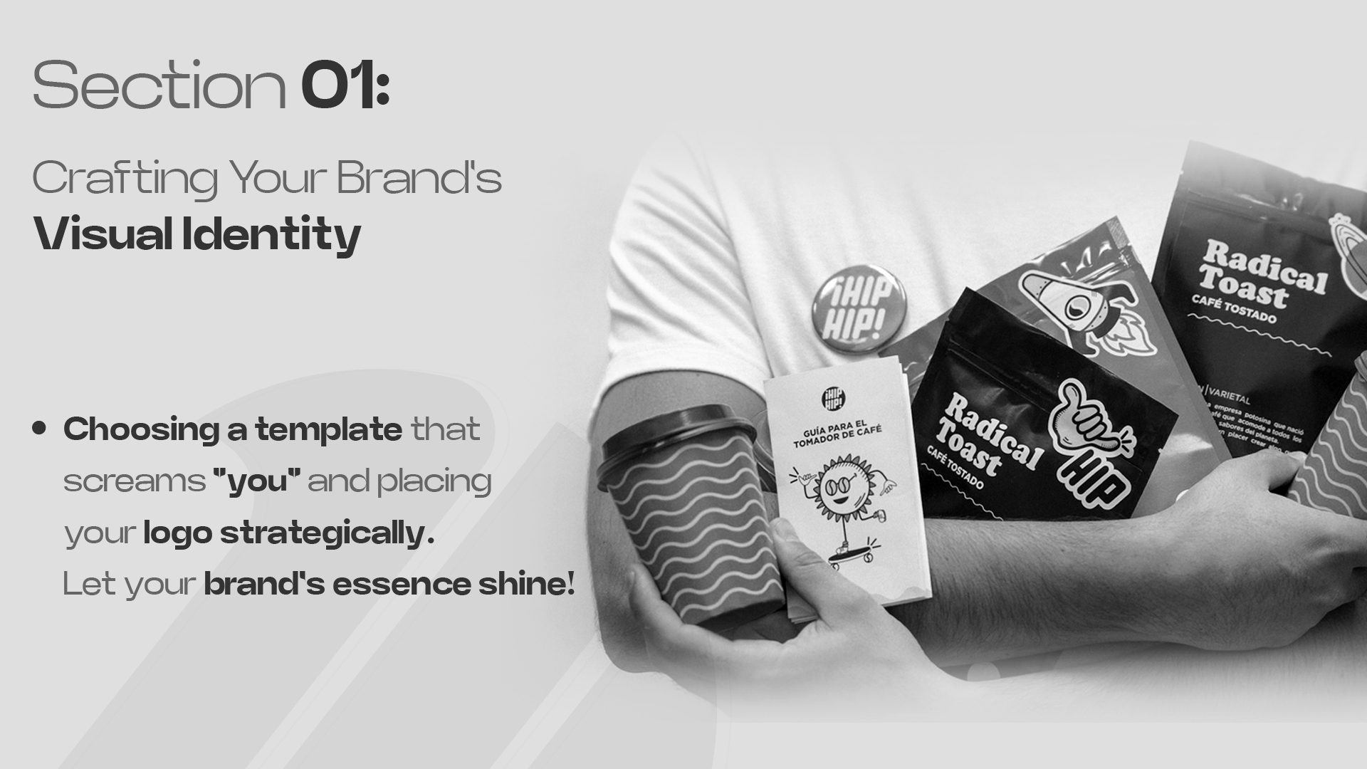
Choosing a Template: Reflect Your Identity
Now that we’ve got the essence nailed down, it’s time to pick a template. Think of a template as the basic outfit for your business card. You want it to match your brand’s personality. If your brand is all about modern, cutting-edge ideas, a sleek, minimalistic template would be your go-to. On the other hand, if your brand is more about tradition and reliability, maybe something classic and elegant. This choice sets the stage for everything else. It’s like choosing the perfect background music for your favorite scene in a movie!
Logo Placement: Making an Impact
The logo! It’s like your brand’s signature. Where you place it on your business card can make a statement. Top left? It’s traditional, familiar. Center stage? Bold, confident. Remember, you want it to be the first thing that catches the eye. It’s like the lead singer of a band – it should stand out but still gel perfectly with everything else on your card.
Isn’t it fascinating how a little card can say so much about your brand? It’s like a mini-advertisement for you and your business. What do you think about how to make a good business card?
Typography and Readability
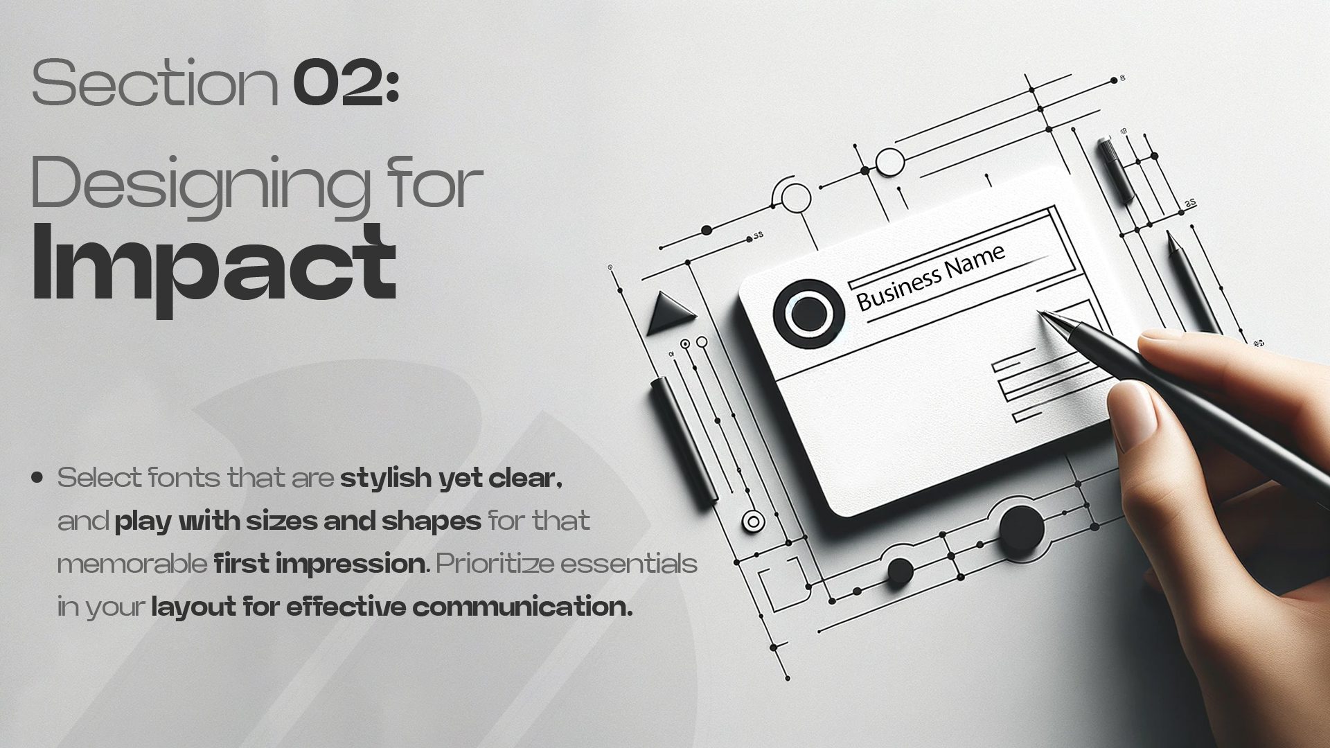
Font Selection: Style Meets Clarity
Okay, imagine you’re at a bustling network event. You’ve just met someone super interesting, and you hand them your business card. You want them to look at it and think, “Wow, this looks professional!” That’s where your font choice steps in. It’s not just about picking a pretty font; it’s about finding the perfect balance between style and clarity.
Think of fonts like different outfits. Some are flashy and fun, like a party dress, while others are more like a sleek business suit. For your business card, you want something more on the business suit side. Why? Because it needs to be super easy to read at a glance.
But hey, don’t get me wrong, easy to read doesn’t mean boring! You can still show off your brand’s personality. If your brand is modern and chic, maybe a clean, sans-serif font like Helvetica or Arial would be a great fit. More on the traditional side? A serif font like Times New Roman or Garamond could be your best friend. The key is to make sure the font is not too fancy or too condensed. Remember, you want people to read your name and contact info effortlessly! That’s what makes a good business card.
Text Arrangement: Balanced and Legible
Now, let’s talk about arranging your text. It’s like arranging furniture in a room. You want everything to be in just the right place for it to look and feel great. On a business card, you’ve got limited space, so how you place your text matters.
First up, don’t cram too much info on the card. It’s tempting to put every social media handle, phone number, and email address, but it can get overwhelming. Stick to the essentials: your name, what you do, and the best way to contact you.
The layout should feel balanced. You don’t want all your text squished in one corner, right? Spread it out a bit. Play around with aligning some text to the left, some to the right, or even centering important details. This creates a visual flow that guides the reader’s eye smoothly across the card.
Also, think about the size of your text. Your name and job title can be a bit larger, making them stand out. Details like your phone number or email can be smaller, but still clear and easy to read.
Designing a killer business card is all about making smart choices in typography and how you arrange your text. Choose a font that’s stylish yet clear, and arrange your text in a way that’s balanced and easy on the eyes.
What do you think makes a business card stand out? Have you seen any designs that caught your eye?
Size and Shape: The First Impression
Think of the first time you see a business card. Its size and shape are the first things you notice, right? They’re like the handshake of the business world – making that crucial first impression.
Standard vs Unique Sizes: Pros and Cons
Standard Sizes
What are they? These are the usual, go-to sizes for business cards. Imagine the size of a credit card – that’s pretty much it.
Pros:
Fits Everywhere: They easily slide into wallets, cardholders, and pockets. No fuss!
Cost-Effective: Being the norm, they’re usually cheaper to print.
Instant Recognition: People recognize this size instantly as a business card.
Cons:
Might Blend In With so many out there, it’s easy for yours to get lost in the shuffle.
Unique Sizes
What are they? These are the cards that break the mold, stepping away from the standard size.
Pros:
Stand Out: They catch attention because they’re different.
Creative Freedom: You get more space to play around with designs and information.
Cons:
Tricky to Carry: They might not fit in standard cardholders or wallets.
Costs More: Unusual sizes can be pricier to print.
Shape Options: Beyond the Rectangle
Now, let’s talk about shapes. You’re not just stuck with rectangles!
Traditional Rectangle
Why it’s popular: It’s classic, professional, and fits everywhere.
But Remember: It’s common, so it might not make a bold statement.
Creative Shapes
Circular, Oval, or Even Triangular: These shapes are instant eye-catchers.
Custom Die-Cut: Think of shapes that reflect your business. A baker? How about a cupcake-shaped card?
Pros of Creative Shapes
Unique Vibe: They make your card (and you) memorable.
Brand Alignment: The shape can align with your brand’s identity.
Cons of Creative Shapes
Practicality: Odd shapes might be hard to store or carry.
Cost: More complex shapes can be more expensive to produce.
Remember, your business card is a tiny representation of you and your brand. It’s all about making it unique while keeping it practical. What kind of business card would make you say “Wow, this is cool!”?
In this age of the digital world, a well-crafted business card transcends paper rectangles and becomes a brand ambassador. Forget cookie-cutter templates – dive into the art of designing cards that spark conversations, not dust bunnies! Let’s transform your vision into a tangible masterpiece with our expert business card design services. We’ll craft your mini-masterpiece, a testament to your brand’s unstoppable force. Remember, boring rectangles are for the network newbies – join the ranks of the design heroes with our expertise!
Effective Information Layout
When we’re talking about business cards, the layout is like the first impression you make at a party. It’s got to be just right! Imagine your business card as a tiny billboard. It needs to catch someone’s eye, but not overwhelm them. Think clean, uncluttered, and organized. Let’s discuss what information on business cards is important.
What to Include: Essentials Only
Do you know how sometimes less is more? That’s exactly the case with business cards. Only the VIPs (Very Important Pieces of information) should be cut. So, what are these essentials?
Name: This one’s a no-brainer, right? Your name is like the headline of your card.
Job Title: It tells people what you do and hints at what you’re great at.
Company Name: It’s the team you play for, your business backbone.
Contact Information: This is your “Call me, maybe?” part. Include your phone number, email address, and maybe your LinkedIn profile. But don’t go overboard. It’s not a contact form!
Logo: If your company has a logo, flaunt it! It’s part of your brand’s identity.
That’s what information should be on a business card to make it informative and more purposeful.
Craving cards that ignite the Insta-spark? Adding your Instagram to your business card is a breeze! First, snag your handle’s official icon directly from Instagram. Pop it onto your design like a digital handshake, ready to beckon followers with every handshake. Or, level up by adding a QR code, your portal to your online haven. Simply copy your Instagram URL, toss it into a magic spell (aka a QR code generator), and voila! One scan and you’re Insta-connected, leaving a lasting digital trail alongside your physical presence. Ditch the networking awkwardness – let your business card be your digital ambassador, sparking curiosity and connections with every interaction. Now go forth and conquer the Insta-verse, one card at a time.
Hierarchy of Information: Prioritizing Content
Imagine you’re at a buffet. You can’t possibly eat everything (well, you could try, but let’s not go there). You pick the best-looking dishes first, right? That’s how hierarchy works on your business card.
The Headliner: Your name and job title are the stars of the show. Make them stand out. Bigger font? Bold? You decide!
Supporting Acts: Your contact details are important, but they’re not the main attraction. They should be easy to find but not hogging all the limelight.
Visual Treats: Logo design or any design elements should complement, not compete. They’re like the cherry on top, not the whole sundae.
A business card that balances these elements is like a well-mixed cocktail – just perfect. Remember, it’s all about making it easy for people to see who you are, what you do, and how they can reach you.
Designing with Purpose
Double Duty: Utility and Aesthetics
When creating a business card, think of it as a mini-me of your brand. It needs to be useful (giving out your contact info) and look amazing at the same time. Imagine a card that not only tells who you are but also shows the person holding it. That’s the goal!
Call to Action: Spur Engagement
Ever thought of your business card as a conversation starter? It should have something that makes people want to reach out, like a catchy phrase or an irresistible offer. It’s like saying, “Hey, let’s not just meet and forget. Let’s talk business!”
The Art of White Space
Balancing Act: Less is more
Ever seen a card so cluttered you don’t know where to look? Yeah, let’s avoid that. White space isn’t just blank space; it’s a powerful design tool. It makes your card look clean and organized. Remember, sometimes less really is more.
Focused Attention: Highlighting Key Elements
Use white space to spotlight the most important stuff – your name, number, or whatever you want to emphasize. It’s like using a shining spotlight in a dark room. You want people to look at the right thing, right?
Adding Special Features
Unique Elements: Distinctive Appeal
This is where you get to be creative! Think of textures, colors, and a funky shape. Maybe even a little something that feels nice to touch. It’s all about making your card so cool that people don’t just shove it in their wallets and forget about it.
Interactive Add-ons: QR Codes and More
Here’s where tech meets paper. A QR code can take people straight to your website or special offer. It’s like a magic portal from your card to the online world. Who wouldn’t want to scan and see where it leads?
The Final Checks
Proofreading: Precision is Key
Imagine giving out a card with a typo. Yikes! Triple-check everything. Spelling, numbers, emails – everything. It’s like checking your teeth for spinach before a photo. You want to look your best, don’t you?
Print Quality: Ensuring Excellence
Last but not least, print quality. A great design can be ruined by poor printing. It’s like baking a beautiful cake and then burning it. Make sure your card feels as good as it looks.
And there you have it! A roadmap to creating a business card that not only shares your contact info but also tells a story about you and your brand. It’s a small canvas, but with a bit of creativity, it can make a huge impact.
Confused about card chaos? Our ultimate guide to business card design unravels the mysteries! Master layouts, conquer fonts, and even play with graphics like a champ. No downloads, no tears, just professional results at your fingertips.
So, what do you think makes a business card unforgettable? Have you ever received a card that stood out to you?
FAQs:
Can you provide some guidance on 5 tips for designing a business card?
Five tips for designing a business card:
Keep it simple and clutter-free
Use legible font and appropriate colors
Include essential contact information
Incorporate your branding elements
Opt for high-quality materials
Is there a recommended way to create a business card design?
When it comes to creating a business card design, it is recommended to use design software or online tools to design and customize your card. You can also hire a professional designer if needed.
What can I do to make my business card stand out and be memorable?
To make your business card stand out and be memorable, you can:
Use unique shapes or materials
Include a catchy slogan or tagline
Add a personal touch or creative element
Use striking visuals or images
Make it interactive or functional
What is considered the proper format for a business card?
The proper format for a business card typically includes:
Standard size (2 inches by 3.5 inches)
Your name and/or business name
Contact information (phone number, email, and website)
Logo and branding elements
Optional: a brief description of your services or a QR code for easy digital access.
Remember, these are general guidelines, and you can always customize your business card design based on your preferences and industry.