Infographics Design Trends
In the world today, getting the attention of the target audience as quickly and as efficiently as possible is very important. For this, infographics have emerged as an effective means of achieving the goal by merging images and data. However, like all other things in design, trends in infographics are never set in stone. Well, how do you adapt to such change? Let’s explore the key trends in infographic design that are currently defining this visual field.

Latest Trends in Infographics: Creative Elements
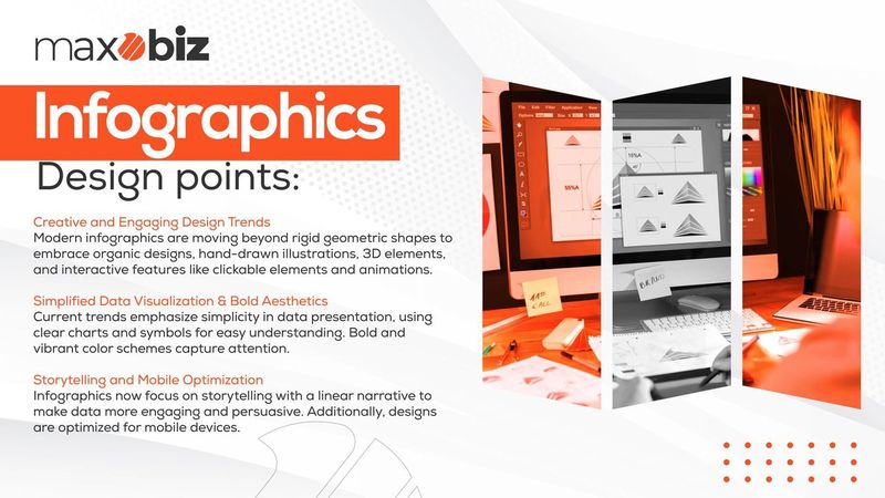
Goodbye to non-flexible and non-creative geometric shapes of infographics. Modern trends in creating infographics focus on using one’s imagination and going beyond the standard structure. Other trends that are being noticed are the use of organic shapes, illustrations done by hand, and even the use of 3D in infographics. Thus, you can make infographics not only eye-catching but memorable, thanks to their uniqueness and creativity.
Data Visualization Techniques: Simplicity is Key
Complex data can sometimes be chaotic but the use of the right tools and methods make it easy and fun to delve into. The current trend is to keep it simple when presenting data. Imagine simple and sleek charts, geometric lines, and elementary symbols. This approach assists the viewers to understand the data presented easily hence making the infographic more efficient. Some of the modern trends are pie charts, bar graphs, and even infographic presentations that include several data forms.
Interactive Features: Engaging the Audience
Traditionally, static infographics are the new interactive experiences. This way, when users scroll through your infographics, they can see clickable elements, hover effects, and animations, which prompt them to dig deeper into the content. This trend is particularly helpful for topics that may require more detailed information that users can gain progressively as they scroll down.
Also Read This Blog: Infographics vs. Traditional Content: Why Visuals Win Every Time
Color Schemes: Bold and Vibrant
When it comes to infographic design, color is an important aspect and in the recent world, trends involve the use of bright colors. This is because bright colors not only capture attention but also assist in sorting information into categories. Do not overcrowd it with numerous colors because this may confuse you and overshadow the message you want to convey.
Typography Choices: Making a Statement
Typography is not only measured by legibility but it also contains an element of character. Typography on infographics tends to be more aggressive and more declarative, dictating the mood of the provided information. It can be combined with simpler and classic fonts to have a balanced and pleasing-to-the-eye layout. Proper font selection allows the audience to be led through the infographic as well as highlighting important areas.
Storytelling Methods: A Narrative Approach
It is important to always remember that an infographic is not just data, but the story behind it. The modern tendency is based on the linear sequence reflecting the reasoning of the diagram and connecting these pieces of information smoothly and interestingly. Apart from making the infographic more informative, this approach makes it more persuasive to the viewer and also helps the viewer retain the information presented.
Mobile-Friendly Designs: Optimizing for All Screens
As more people access information through mobile devices, it is crucial to design infographics convenient to read on mobile. There is a shift to vertical design which makes it possible to scroll on the smartphone screen horizontally. Taking into account how the text may come across on smaller screens, and how visuals will appear on a smaller scale is also important in increasing audience.
Infographic Layout Trends: Going Beyond the Grid
Though, grids have always been a part of infographic design now it’s challenging with more lively designs. It is becoming more acceptable to have asymmetrical layouts, share common elements with spread, and even use collages for different looks to appear more contemporary. These layouts depart from the conventional format and make for a more appealing presentation visually.
Also Read: Best Multi Point Process Infographic Trends
Conclusion
Therefore, a constant update with such changing infographic design trends can help in being ahead within the sphere of visual communication. By being creative and infusing some elements, Maxobiz, applying the theory of simplicity is better in data visualizations adding interactivity, using colors and typography, telling a story, designing with mobile, and trying out different approaches, you have the capability of creating highly effective infographics but also engaging ones. Thus, no matter whether you are a businessman who needs to share some relevant data or a designer who wants to set a trend, these trends will be your beacon in the vast realm of infographic design.


