PowerPoint Design Elements: The Foundation of a Great Presentation
Designing an efficient PowerPoint presentation is not all about putting content on every slide and inserting bulky images and graphics. It is about creating something that would be enjoyable to look at while at the same time conveying a message that you would want to be easily understood by everyone. To accomplish this, you should concentrate on the operation of seven pivotal elements of PowerPoint design that can perk up the presentation. Now, let us consider these crucial aspects.
Key Components of PowerPoint: Layout and Structure
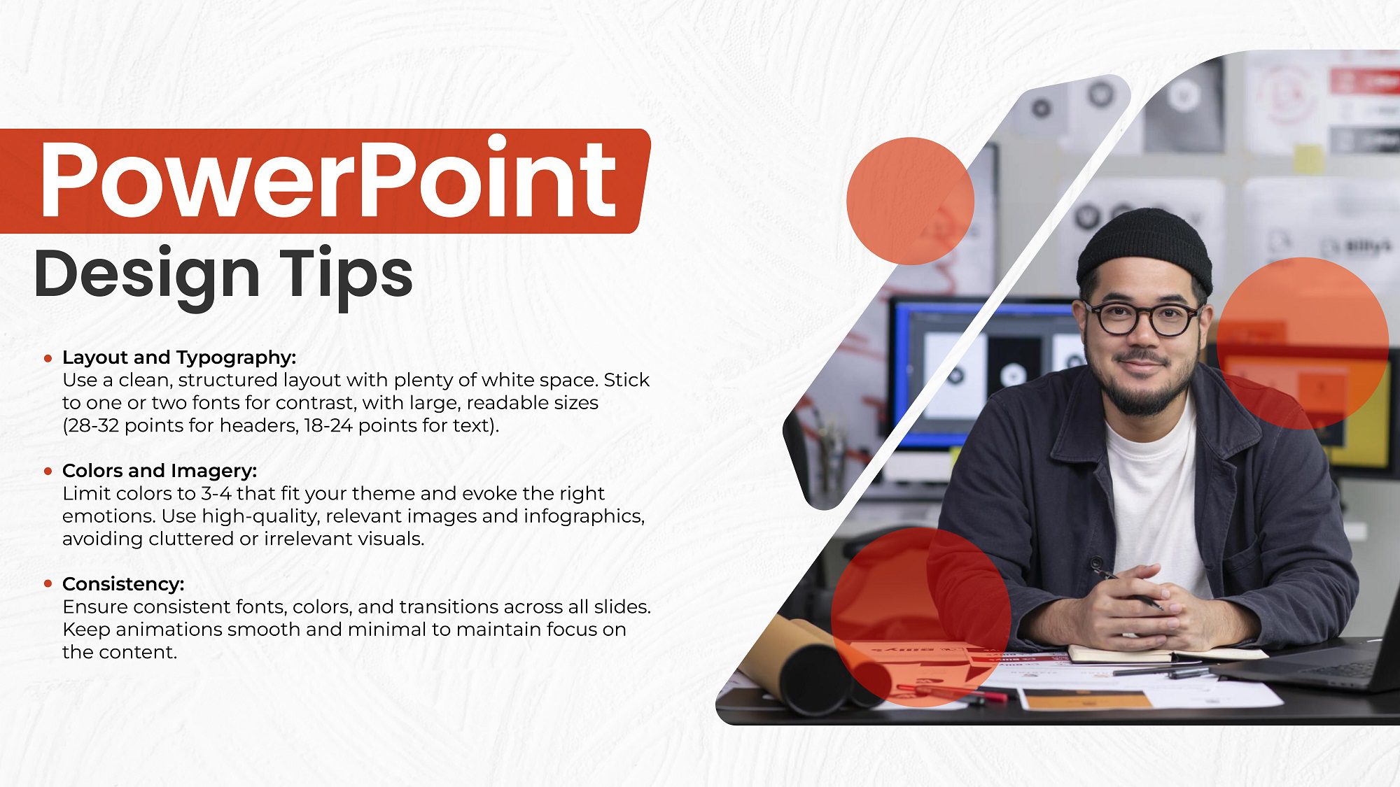
The design of your presentation’s layouts is one of the most important key aspects of PowerPoint design. Structure also plays a crucial role while one reading your work as it will help them to comprehend it effortlessly. Start by applying a grid system on all the slides. This aids in the proper alignment of text, images, and other objects evenly. Ensure the slides are not packed full of content and therefore large writing is unnecessary. You should utilize the white space where it is needed so that the content you have designed does not look cramped, but well-designed and neat.

Design Principles for Presentations: Typography Matters
Typography is another major factor in the design principles related to presentations. The fonts you choose will be a crucial determinant of your presentation’s success or lack of it. Limit your font choices to one or two—and better yet you can have one serif font and one sans-serif font. That complements the previous section and helps to add contrast while not making the text too hard to read, though. Make sure the font that you have chosen is large enough to be seen from the back of the classroom, it is advisable to use a font size of 28-32 points for the header, and 18-24 points for the text. The continuity of the usage of the font throughout different slides is an essential aspect of observing professionalism.
The Impact of Color Schemes
Another important component of PowerPoint designing is using colors that can involve emotions and adjust the mood in the course of presenting. Select colors that are related to your topic and do not cause visitors to strain their vision. For instance, blues and greens are soothing and good for business PowerPoint presentations, and reds and oranges for more passion-making themes. To avoid confusion keep the number of colors used to a bare minimum, ideally using not more than three or at most four. Also, it is advisable to have contrasting text colors in the background to make reading easier.
The Power of Imagery
Overall, it would be sufficient to state that imagery is one of the components of PowerPoint that can help make the presentation more engaging. It has been ascertained that the use of good quality images and graphics design would enhance your ability to pass your message across than using only text. Ensure that the images used are related to the content of the particular post and also do not use most of the boring and irrelevant stock images. Another form of presenting data is through infographics. Just remember to always keep images in line with your general layout and always avoid pixelated or distorted photographs.
Consistency is Key
In presentations, one of the basic rules of design is consistency. Sticking to the font as well as color schemes throughout the different slides ensures that there is continuity to make your PowerPoint presentable and easy to follow. This implies that the color is consistent, the fonts used, and even the structure plan of the website. Both the transitions between slides and the usage of animations must also be consistent throughout the presentation. Do not use highly obtrusive animations that may prejudice the perception of your content. Instead, opt for a smoother transition that does not threaten to overpower the content with the aesthetics of presentation.
Also Read: Importance of Professional Powerpoint Templates
Conclusion: Crafting a Winning PowerPoint Presentation
Incorporating these above-discussed PowerPoint design elements can help you deliver an effective message and make a lasting impression on your audience. By considering the layouts, font styles, colors, images, and coherence, one could design the PowerPoint other than beautiful as well as effective. Just keep in mind that the nitty-gritty of the presentation makes the difference between good and great, so always make your design thought through.
Are you prepared to captivate the audience with your next PowerPoint presentation? Begin to apply such design principles, and you are on a set path to developing eye-catching slides!
Also Read: Infographics Design Trends: Staying Ahead in Visual Communication


