Unique Banner Ideas: Stand Out with Creativity
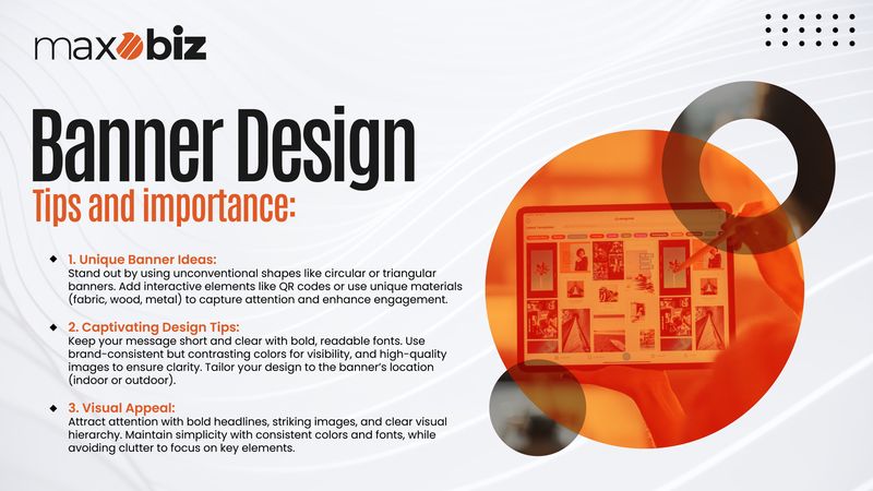
When it comes to banners, the main aim of designing is to attract attention and convey information. But how do you ensure your banner is distinguishable amongst all the other graphics that are out there? The answer is found in innovative reflections of ideas expressed on banners that are different from the traditional ones. You do not need to use mere boxes or rectangular prism shapes; go for various forms and try different sizes. For example, circular or triangular banners can immediately attract the attention of the audience, as it is not an ordinary form. Click here to check out outstanding banner designs created by Maxobiz.

Another creative approach is to introduce elements of interactivity. Placing a call to action, such as appealing QR codes that bring the audience to your social media pages or special offers, takes the audience beyond a simple glance at the banner. Click here to learn more about QR and other innovative digital technology that replaces traditional business cards with digital elements and how it works. Moreover, there is also an option to use unconventional materials such as fabric, wood, or metal, which add a tactile element to the banner. These tiny but distinct additions can amplify your banner and make it more appealing to readers.
Captivating Banner Creation: Tips for Designing Banners That Wow
Designing a visually appealing banner is not just coming up with a place to put the text and the images. It is about creating a design that is attention-catching but also meaningful to your target audience. To begin, be sure your message is short and specific. One must also avoid overloading a banner because this will only lead to confusion among the viewers and losing sight of your objective. Choose large fonts that are clear and readable, and avoid using very thin or weak fonts that may not be visible from afar.
Also, Read the following Article: Unique Ideas for What to Put on Your Business Card
Color is equally important when it comes to designing banners. Select colors that are close to your brand to maintain consistency but select colors that contrast sharply enough from one another to make it easy to read. For instance, using illustrations in black or dark colors will make them stand out more if written in white. Next, the use of high-quality images or graphics can also bring an enhanced appeal to the layout. Ensure that the image used corresponds to the message and that the image is of good quality to produce a clear image when printed.
Lastly, consider where you want your banner to be located. Where will it be displayed? Indoor banners may contain more complex graphics and text because people can be closer, whereas outdoor banners focus on readability and the potential impact of weather conditions. Based on these factors, one can come up with a banner that not only attracts the attention of the viewers but is also informative as well.
Also Read: Banner Design Hacks and How to Save Time for Efficient Workflows
Visual Appeal in Banners: The Art of Attraction
Attractiveness is the bedrock of any banner since the essence is to capture the attention of the targeted audience. That’s what makes one stand, look up, and take an interest in what is around them. To achieve the greatest aesthetic value, starting with a definite area of interest would be pertinent—something that grabs your attention right away. This could be a bold headline, a striking image, or an intriguing graphic element located in the header. After catching the viewer’s attention, use the surrounding area of the logo to follow a clear and concise visual hierarchy.
There is something to be said about consistency in this area, as well, for a set of buildings to be visually appealing. Choose related colors and shades of a color that identify your company’s brand when selecting your fonts and design elements. That said, you should not be too limited by the rules of the game since there is a lot of flexibility within the established ones. Done properly, incorporating textures, shades, and gradients into your banner design can even give it a subtle 3D look.
Finally, do not forget that simplicity may well work wonders. Simple and free of unnecessary elements not only makes the message more pleasing to the eye but also works better for conveying a particular message. Do not overcrowd your banner with too much information or too many images. Thus, avoid cluttering the layout and give equal attention to proper distances between elements to let each stand out as a separate entity.
Conclusion:
When implementing the above approaches, you will be able to unleash creativity and create mind-blowing banners. Whether you are advertising an event, a product, or simply your brand, these tips will come in handy to design a banner that is interesting and efficient enough to attract the attention of the subject and communicate the message in a short time.
Click here to see how Maxobiz can elevate your business through branding


