Your book cover is the first thing people notice when they see your book, they will judge your book by its cover—it is the final call to read your book. While colors, images, and layout get the attention, the font does the final convincing part of the deal. A suitable style of writing can create a feeling, inform the audience about the category of a book, and help it be unique in a highly competitive world.
So, what type of fonts are used on book covers, and how do you choose the perfect one? Let’s explore!
Why Choosing the Right Fonts is Crucial for Book Covers
Consider when you are wandering into a store that sells books or scrolling through catalogs online. An attractive title in a bold, dramatic font might draw you to a thriller book.
A whimsical script font? Probably a romance or children’s book. Symbolically, fonts are not only appointed to type the text but also set the expectations of the tone, style, and content of your book.
Here’s why getting the font right is so crucial:
First Impressions Count
Your book cover gets only three seconds to grab the attention. The font you select should easily connect with your target audience.
Establishes Genre
Each genre has its unique ways of representation on the canvas. Choosing fonts for book cover design that align with your genre ensures readers know what to expect.
Reflects Professionalism
Even the best-written book can be spoiled because of the wrong choice of font, or a font that is difficult to read. Readers believe that the content is good if the design is good. Here you can read more about The Power of a Captivating Book Cover: How Design Impacts Sales
Types of Fonts for Book Covers
Fonts have many categories, and each category has different advantages according to your book’s theme and audience. Below are the most frequent types and how to use them effectively.
Classic & Timeless (Great for Literature, Historical Fiction, Memoirs)
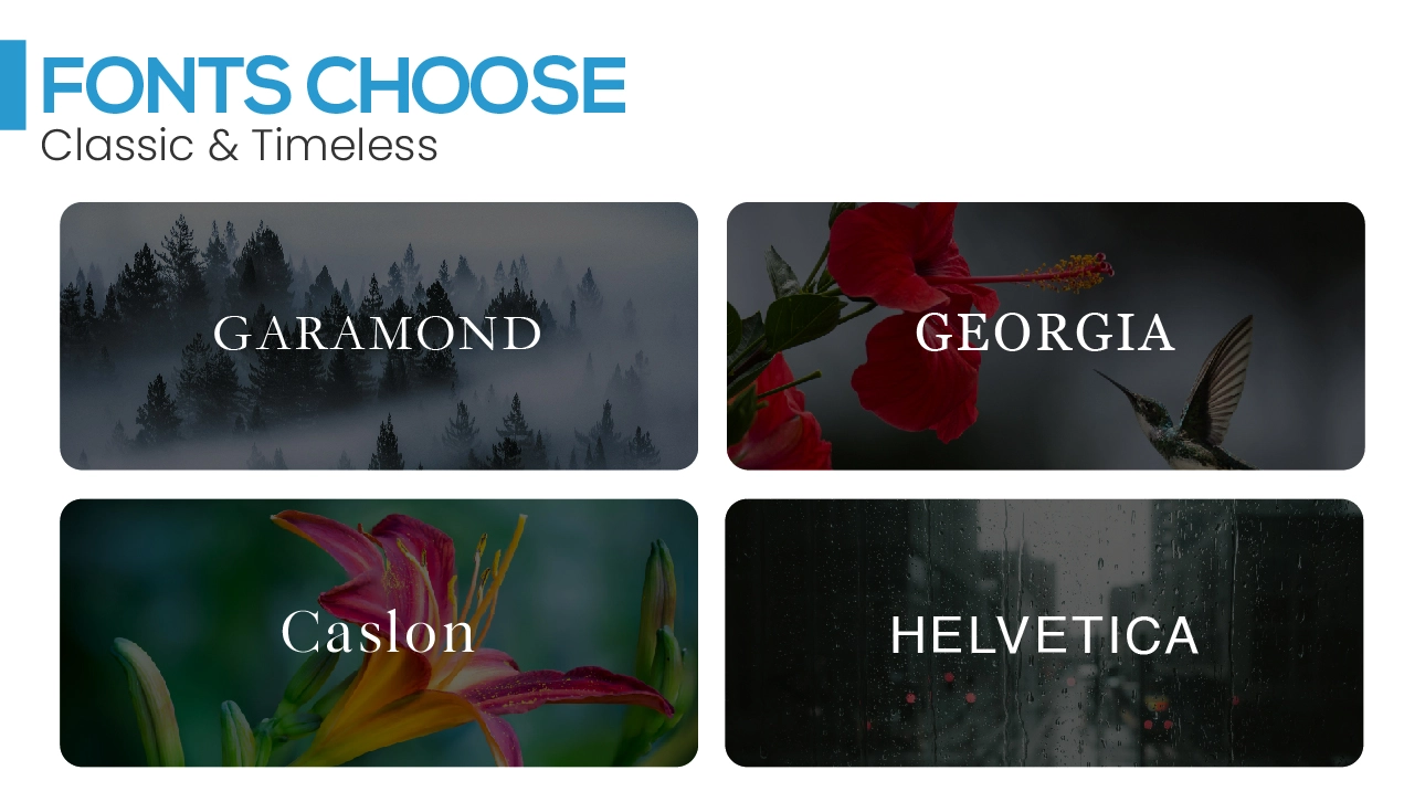
Garamond
This font looks classic and delicate. It is ideal if you are planning to create a sense of professionalism in the outlook of your book.
Baskerville
An elegant traditional typographic font on the list that will never go out of style. Children will find it easy to recognize and write. It is mostly used in literature books that need to create an image of quality and tradition.
Georgia
The Serif font is of modern style but has a traditional appearance. Highly readable in both print format and on screens which is perfect for both digital and paper books.
Caslon
This classical font is very versatile. It can be used for different types of books, which focus on academics or history. That makes it reliable and looks classy.
Modern & Minimalist (Perfect for Contemporary Fiction, Non-Fiction)
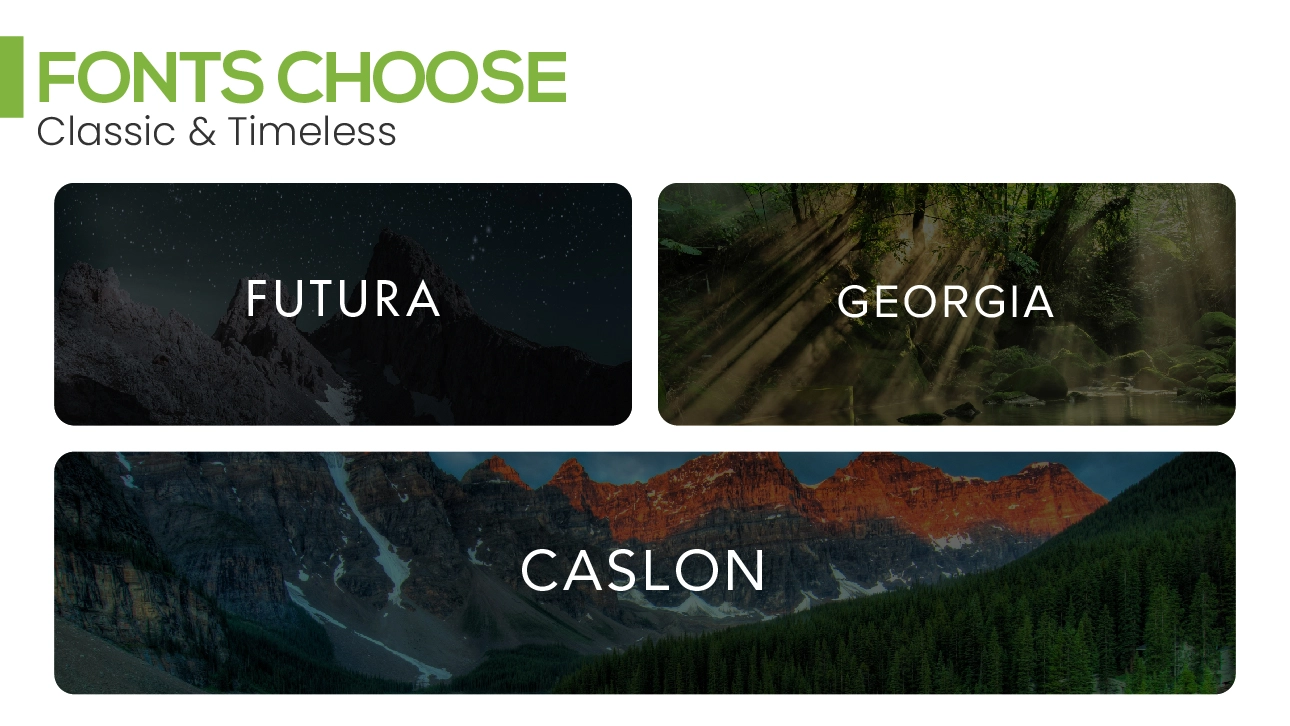
Helvetica
A clear, elegant, and classic type fits into books that require a sleek and professional look. Yeah, it is great for a contemporary outlook.
Futura
It is practically used for futuristic and modernistic books as it is thin, sharp, geometric, and refined. That gives it a very cool, modern appearance.
Proxima Nova
A trendy, sans-serif font that looks very modern. It’s popular for books that want to stay current and feel fresh.
Avenir
A smooth font with minimal curves and a very straightforward appearance. It is preferable for books that want a contemporary and professional polished look.
Elegant & Decorative (Perfect for Romance, Fantasy, Luxury Themes)
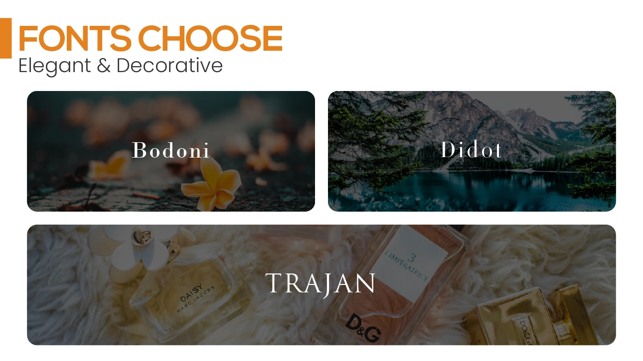
Bodoni
This font has large variations in thickness of the strokes and it is most suitable for luxurious or romantic book covers. This produces a feeling of luxury and sophistication.
Didot
Very graceful and dramatic, the Didot font is best used for books with a theme of glamour or luxury – like fashion and romance.
Trajan
This font gives a historical, majestic feel because it is inspired by ancient Roman inscriptions. It is perfect for epic stories or fantasy books that want to feel grand.
Handwritten & Script Fonts (For Creative or Lighthearted Genres)
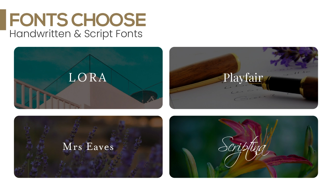
Lora
Lora is a serif font that contains a handwritten feel. It’s a great choice for creative artworks, personal works like memoirs, or artistic books.
Playfair Display
A modern serif Font with high contrast makes it look classy and fashionable. It works well for romance or books that want to feel elegant.
Mrs Eaves
This is an elegant serif font with a bit of personality. It’s often used for unique, personal designs like poetry or creative writing.
Scriptina
A fancy, flowing script font that’s perfect for whimsical or fantasy-themed books. They turn titles into magic making them look more artistic.
Edgy & Bold (Great for Horror, Thrillers, Sci-Fi)
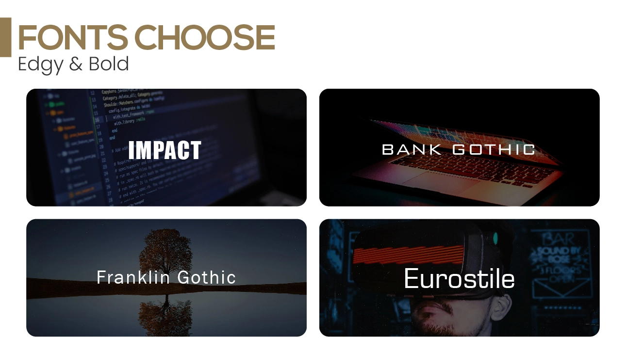
Impact
This is a bold, heavy font that appeals to the audience. It’s perfect for action, thrillers, or horror books that need to be in your face.
Bank Gothic
It is a futuristic sans-serif font that has a cool, techy feel. It’s perfect for science fiction or any book that wants to make a reader feel like they are in the modern world of advanced tech.
Franklin Gothic
An elegant, strong font with a trendy look. It’s ideal for books that require a daring, edgy vibe.
Eurostile
A stylish, clean, geometric font with a futuristic feel. It is commonly utilized for sci-fi or tech-themed books that want a modern, polished look.
How to Choose the Best Fonts for Book Covers
Now that you know what fonts are used on book covers, how do you pick the best one for your project? Here are some tips to guide your decision:
Match the Font to Your Genre
Your font must be able to tell the kind of book you have at first glance. Gothic and decorative font wouldn’t look good on a self-help book, while a minimalistic sans-serif font would look silly on a fantasy novel.
Prioritize Readability
No matter how beautiful a font looks, it must be easy to read—especially at a glance or in small sizes, like a thumbnail image online. Check your design in different sizes to see that you can easily read it.
Limit the Number of Fonts
Limit yourself to between two and three fonts at most. This is not good for the cover because if you blend many styles it becomes messy and may not look professional. Use one font for the title, another for the author’s name, and a simple font for additional text.
Experiment with Hierarchy
Your title should be where the focus lies. Choose a font and size that ensures it stands out. The author’s name and tagline should be less prominent but still complement the overall design.
Stay True to Your Brand
Consider consistency in your typography if you’re an author with multiple books. Consistency in design ensures that your work is branded and audiences can easily identify the books you work on. Here you can learn more on Why Professional Book Covers Matter: Enhancing Your Author Brand
Examples of Great Typography on Book Covers
Here are some examples of books that nailed their font choices:
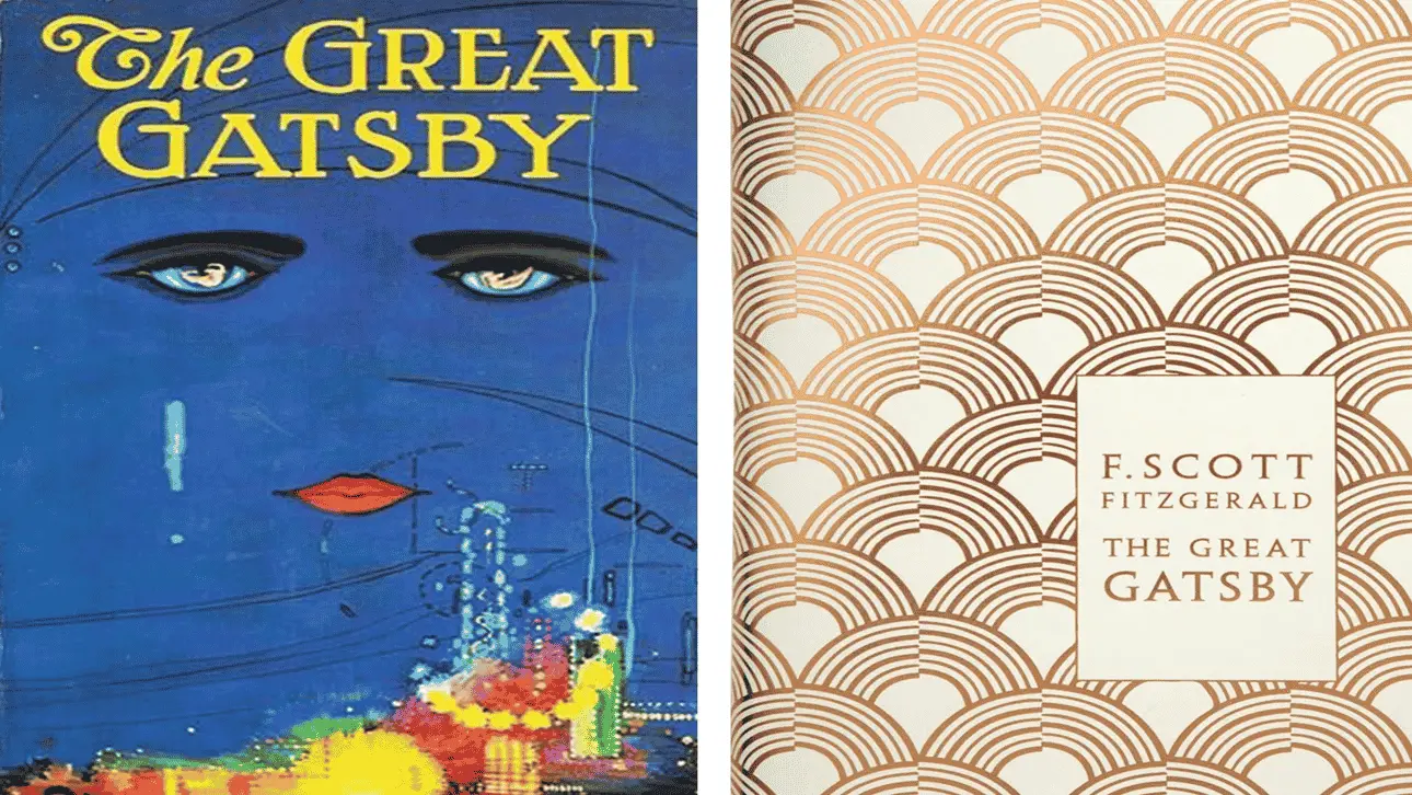
The Great Gatsby by F. Scott Fitzgerald
The usage of a serif font is luxurious and seems to be inspired by the overall theme of the 1920’s.
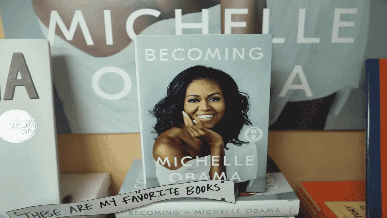
Becoming by Michelle Obama
The sans-serif font feels modern and approachable, mirroring the book’s tone.
Harry Potter by J.K. Rowling
The decorative font screams magic and adventure, perfectly suited for the series.

The Balance Between Aesthetics and Functionality
Selecting the perfect font is all about balance. You want something visually stunning and functional. It should stand out and be easy to read. And, most important, it should be interesting and relevant to your audience.
Conclusion: Are You Planning to Design the Right Cover for Your Book?
Your book needs a cover that grabs attention and makes people stop scrolling. Now that you know what types of fonts you can use on book covers and how to choose the best fonts for book covers, it’s time to put that knowledge into action.
Feeling overwhelmed? Don’t worry—you don’t have to do it alone. Maxobiz is here to help. With expert typography tips for book covers and professional book cover design support, we’ll create a cover that captures your story’s essence and wows your audience.


